Brand strategy design & packaging for LA based artisanal candy makers Sparko Sweets
Sparko Sweets is a brand with a young and cool personality. The challenge was to help develop their brand story that celebrates all aspects of its identity, giving it a sophisticated and mature attitude to relate to the people who love the brand.
In order to achieve that, we had to drift away from the old graphics–which lacked a personal identity and brand story–and rethink the brand according to its new positioning, targeting their strongest range of creative products, along with communicating to an extensive audience.
Brand Identity
Brand Positioning
Digital Design
Design Thinking
Design Strategy
Visual Identity System
Verbal Identity System
Motion Design
Packaging System
Print Prototyping
Photography Art Direction
Indigo Design Award 2020
Gold/Silver
Summary
My role centered on collaborating with Sparko Sweets closely on every aspect of the visual identity framework–beginning with the understanding of developed and emerging markets, through production and sustainability needs–to create a versatile, playful identity with a simple and striking look. Different graphic elements are used to communicate the brand’s personality in a system that speaks with many audiences and adapts to different product categories, always maintaining a great visual impact. With a youthful colour palette aligned with the online universe, the old Sparko Sweets orange-red colour matures and coexists unapologetically with a diverse and modern colour spectrum.
Result
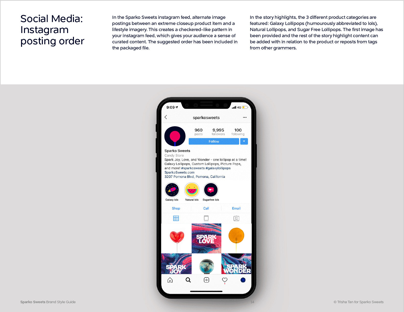
Sparko Sweets’s new visual art direction enabled growth from just 1k followers (when we started the project) to over 10.3k followers on instagram and launched their new packaging at Bloomingdale’s in LA during the holiday season with confidence and stronger brand presence. The project was also awarded a gold and silver in branding and packaging categories in the Indigo Design Awards graphic design division.
Research
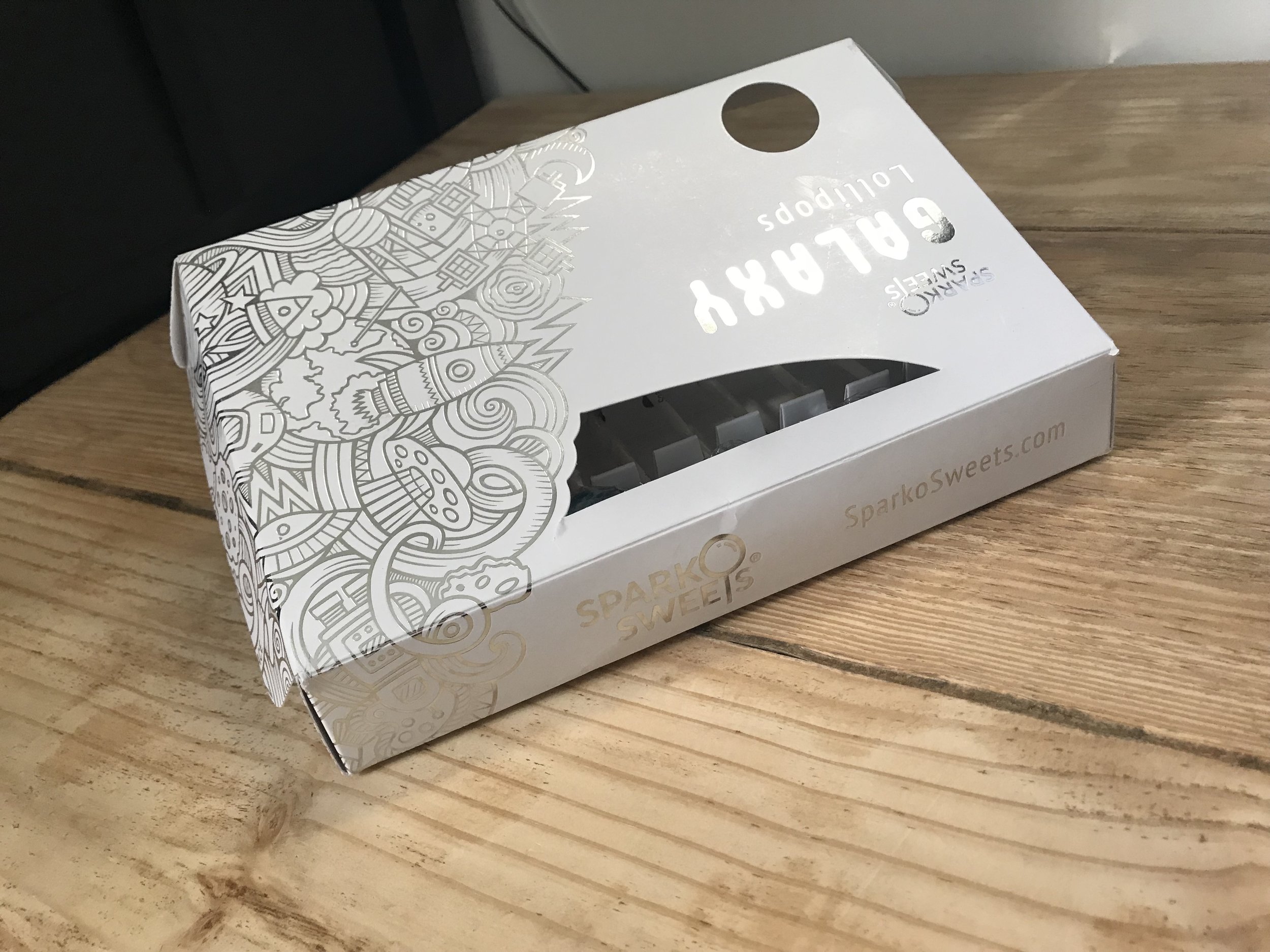
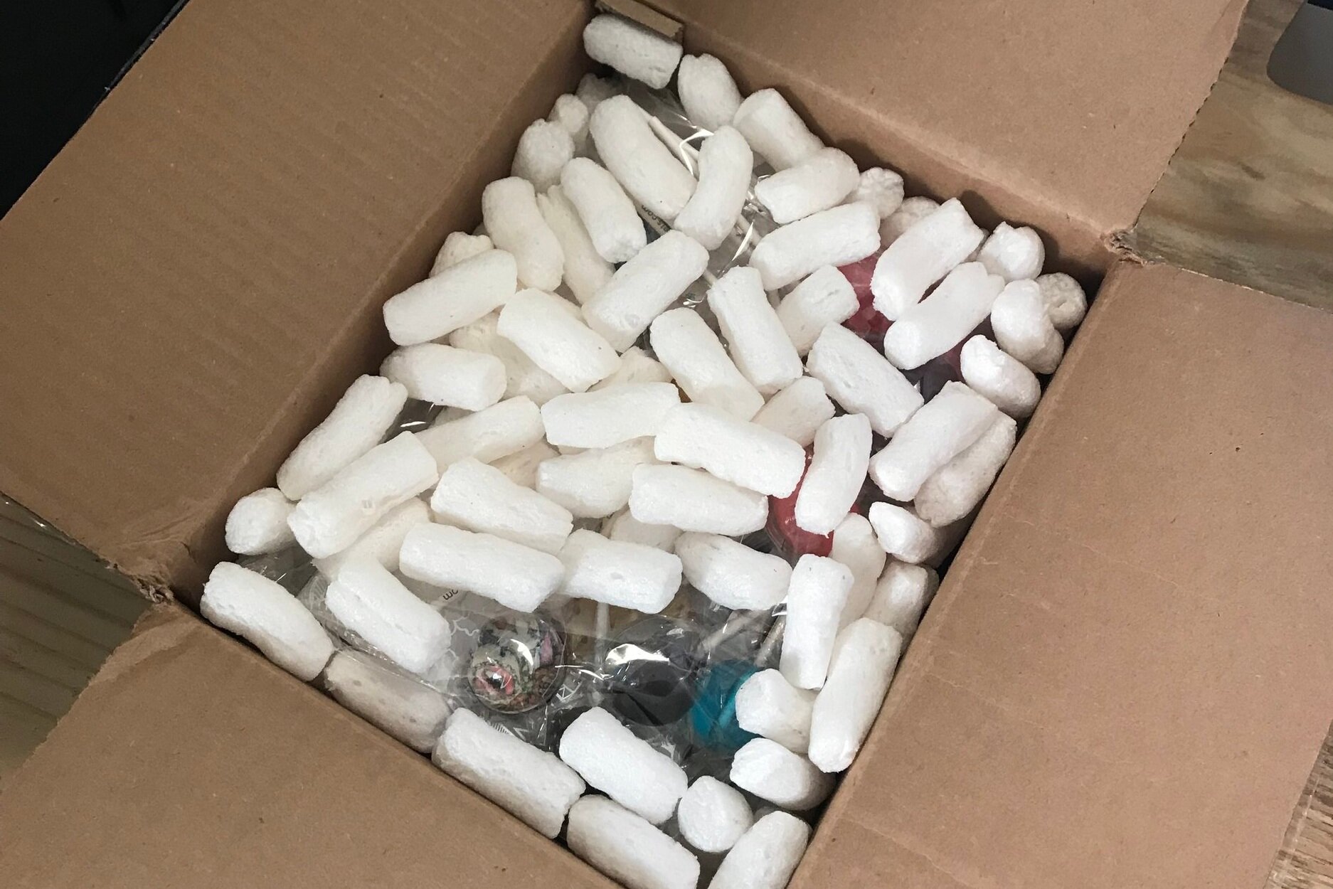
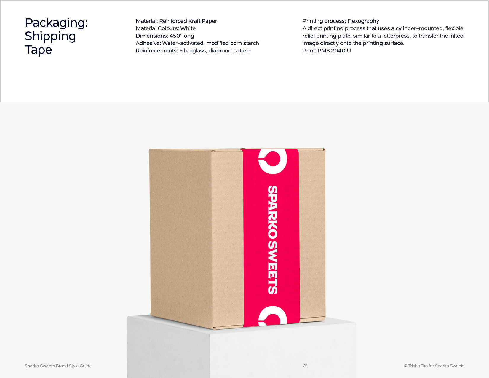
We reviewed the whole experience: existing 10-piece gift box packaging assets and the shipping box exterior, and more importantly, the lollipops. We made note of the elements we liked, what worked, what were less successful, and where can we improve on the product package experience.
Design Research
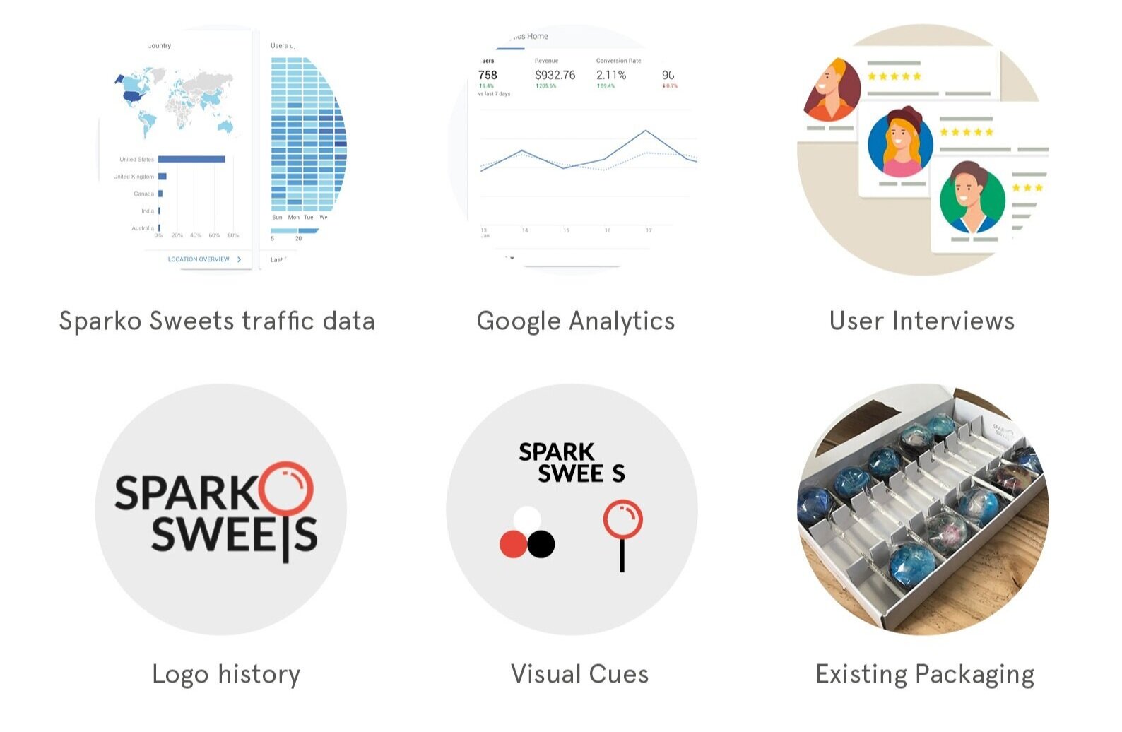
Before embarking into the exploration on design and details, we started this process through these research methods and interviews on how the brand is currently perceived. Analysing the graphic identity through visual perception cues, we are able to assess the brand through design thinking practices. The key areas we’ve looked into are existing strategy, brand voice, design observations, and personality, to make sure we stay true to the Sparko Sweets brand.
Opportunity Outline
Candy consumption is often regarded as a rewarding experience. To encourage our audience to remember the brand, we have the opportunity to tie this experience as a personal, emotional engagement.
Interviews
After interviewing the brand’s founder and running a consistent set of questions through a focus group in different categories, we found that there’s a big range of backgrounds that inform the users. Some of the common findings through this focus group has informed the list of flaws in the current identity and packaging.
Analysis
To enable a stronger brand presence and effective outreach to existing and future marketing and corporate partnership deals, we explored a few themes that were informed by the findings of this brand analysis.
Brand Strategy
Brand: Story
Sparko Sweets lovingly crafts a taste of happiness through their lollipops. In creating the desirability aspect to its core audience, millennial consumers, we introduce the brand story through emotional keywords that becomes its core values, a story that invites users to ‘continue sharing these same values’ by relating to their own personal story.
Design: Make it Identifiable
During interviews, a common thread revolved around the lack of a strong identity as Sparko Sweets introduced its line of customizable lollipops, which unfortunately dilutes its own identity by making it customisable. There is an opportunity for SS to think in terms of how its core product, the galaxy lollipop can be made accessible and identifiable to all their target audiences. Taking this initiative and owning it offers opportunities to expand and solidify its brand story and vision (and also as the leading galaxy lollipop manufacturer in the US).
A few ways we can do this:
Well designed custom Typography, Striking use of Colour on packaging and stem, Duality in Unique Symbol (in the identity)
Packaging: Not just for special occasions
In creating a higher desirability for SS’s audience and with 2019 being a transitional year for SS, SS aims to introduce two new product lines which are the sugar free option and the natural sweetening ingredient to provide a healthier option for everyday consumption. For buyers of premium products, beautiful and minimalist design is important in demonstrating a healthy and luxurious lifestyle.
The visual systems in place should accommodate the various product categories and customization experience, ie. stickers and separate designs.
Social: For everyone
Sold online in a pack of 10 lollipops, this encourages customers to share the SS experience with friends and loved ones.
Brand Positioning
Verbal Identity System
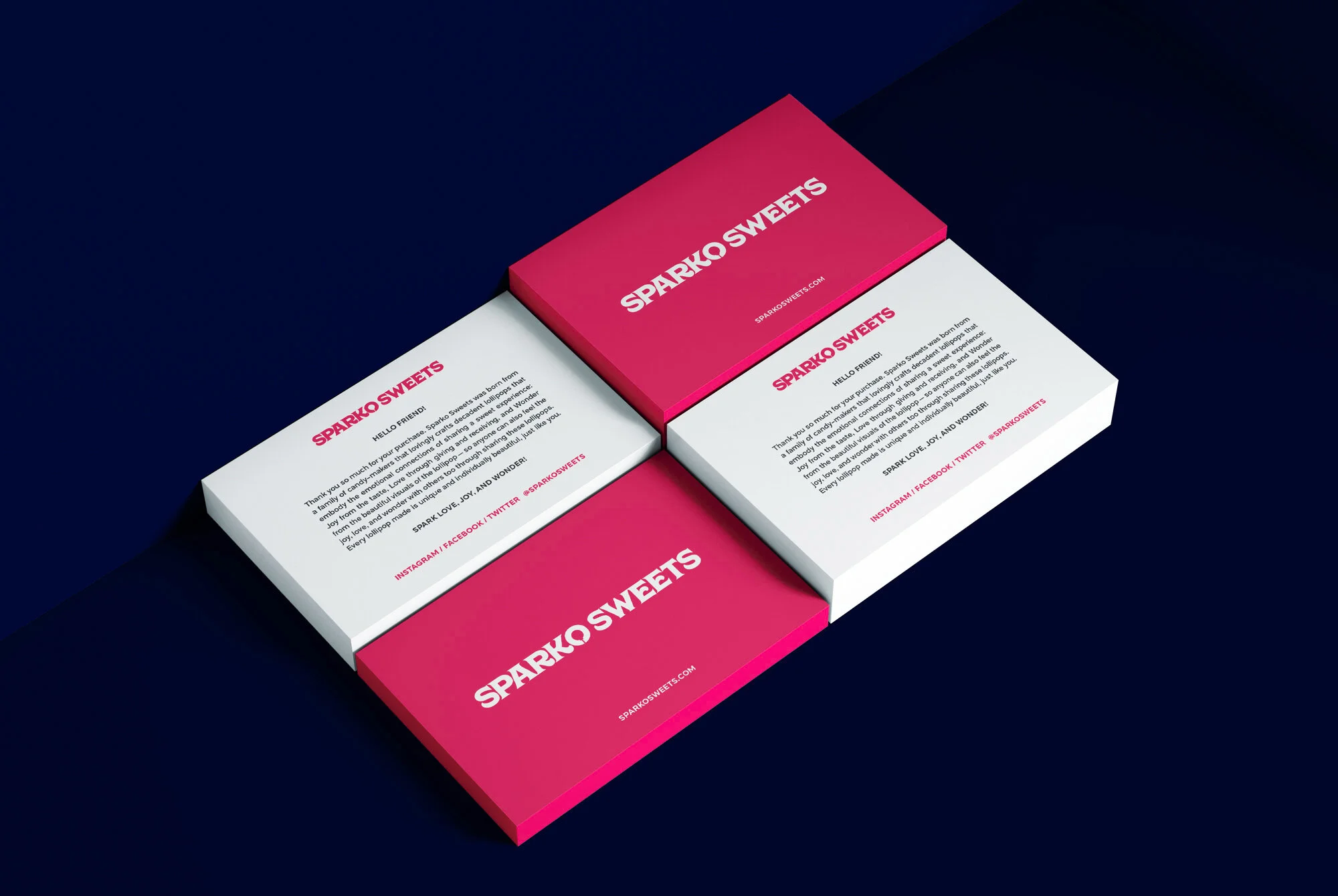
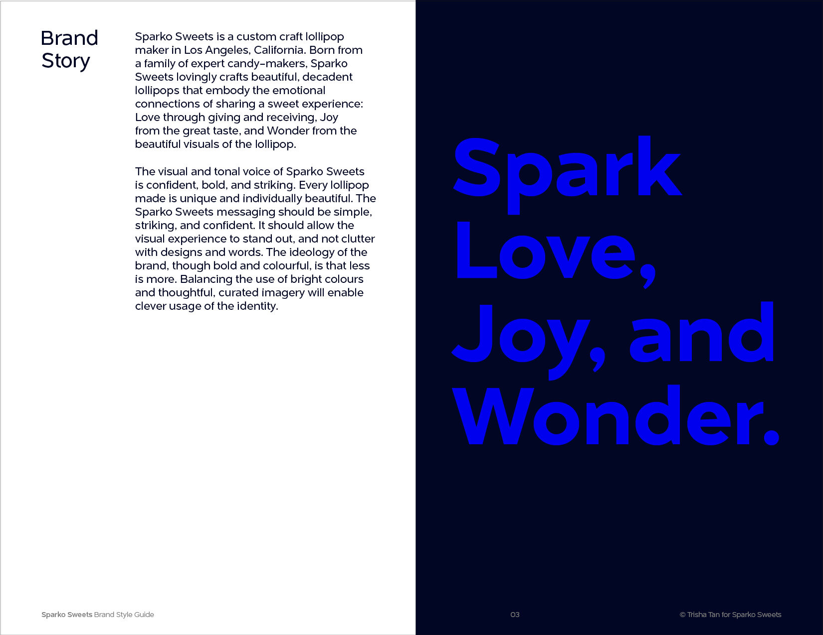
Sparko Sweets is a custom craft lollipop maker in Los Angeles, California that creates beautiful and delectable lollipop designs for everyone. Born from a family of candy-makers that lovingly crafts decadent lollipops that embody the emotional connections of sharing a sweet experience: Joy from the taste, Love through giving and receiving, and Wonder from the beautiful visuals of the lollipop–so anyone can also feel the joy, love, and wonder with others too through sharing these lollipops.
Visual Identity System
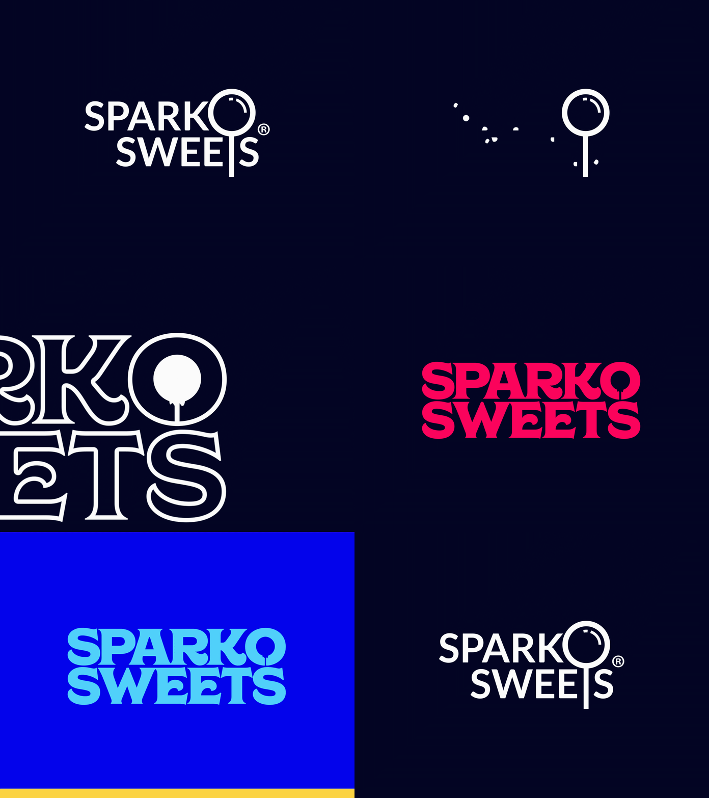
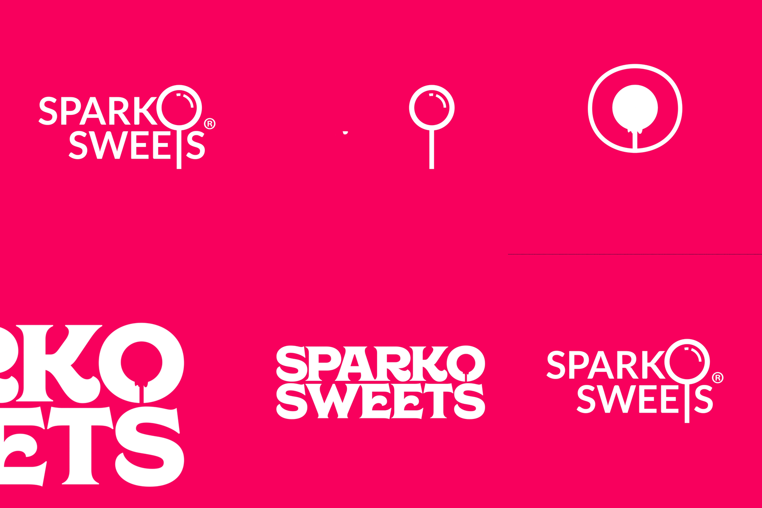
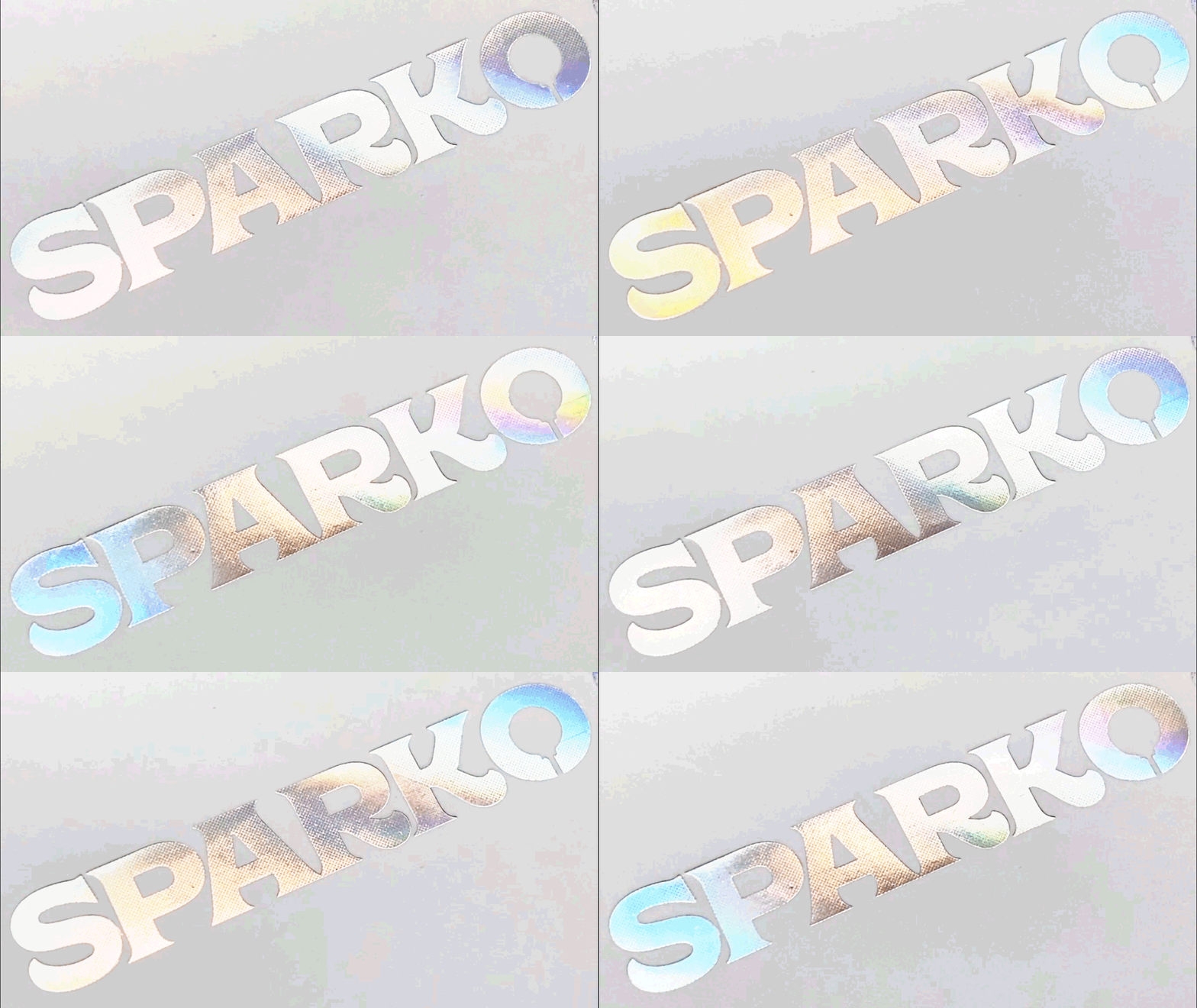
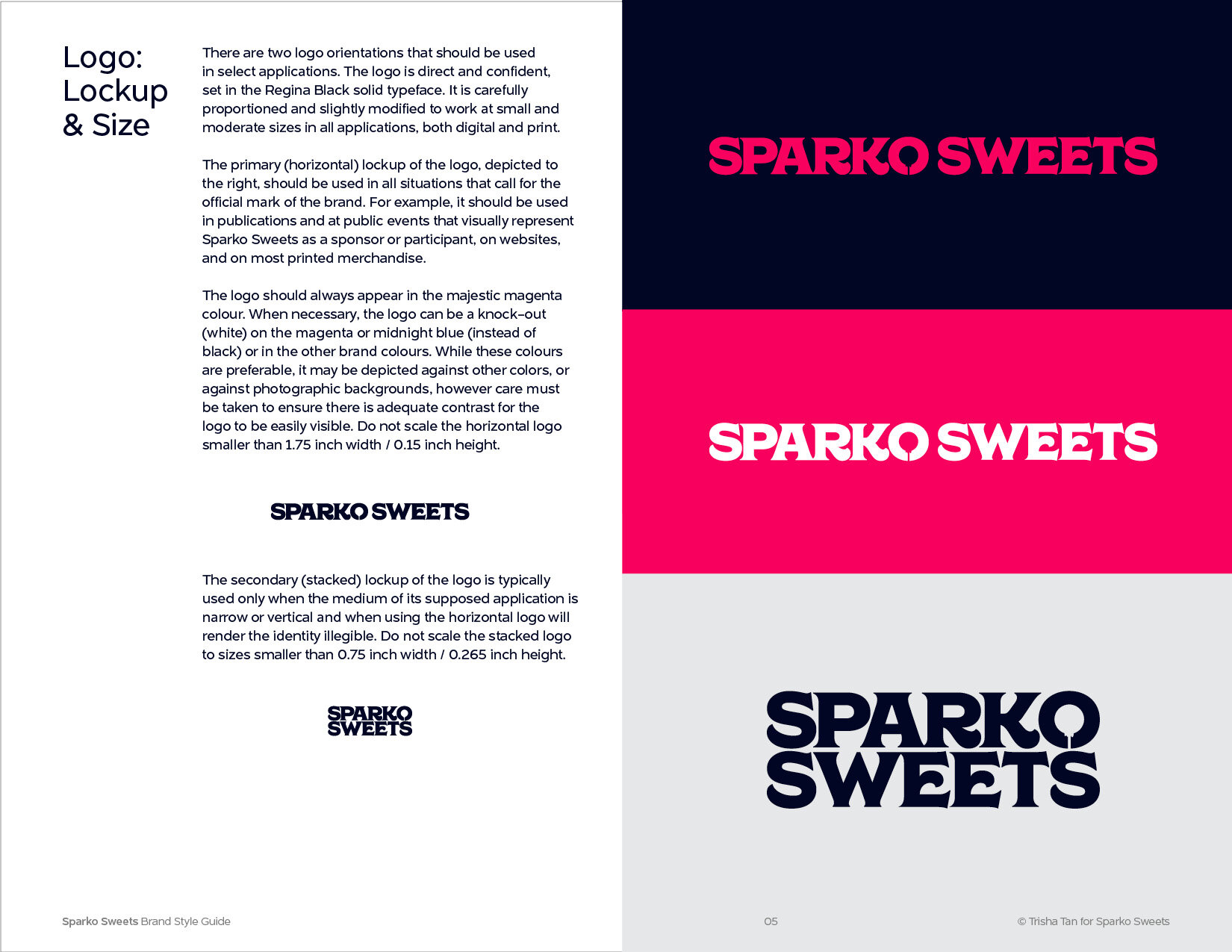
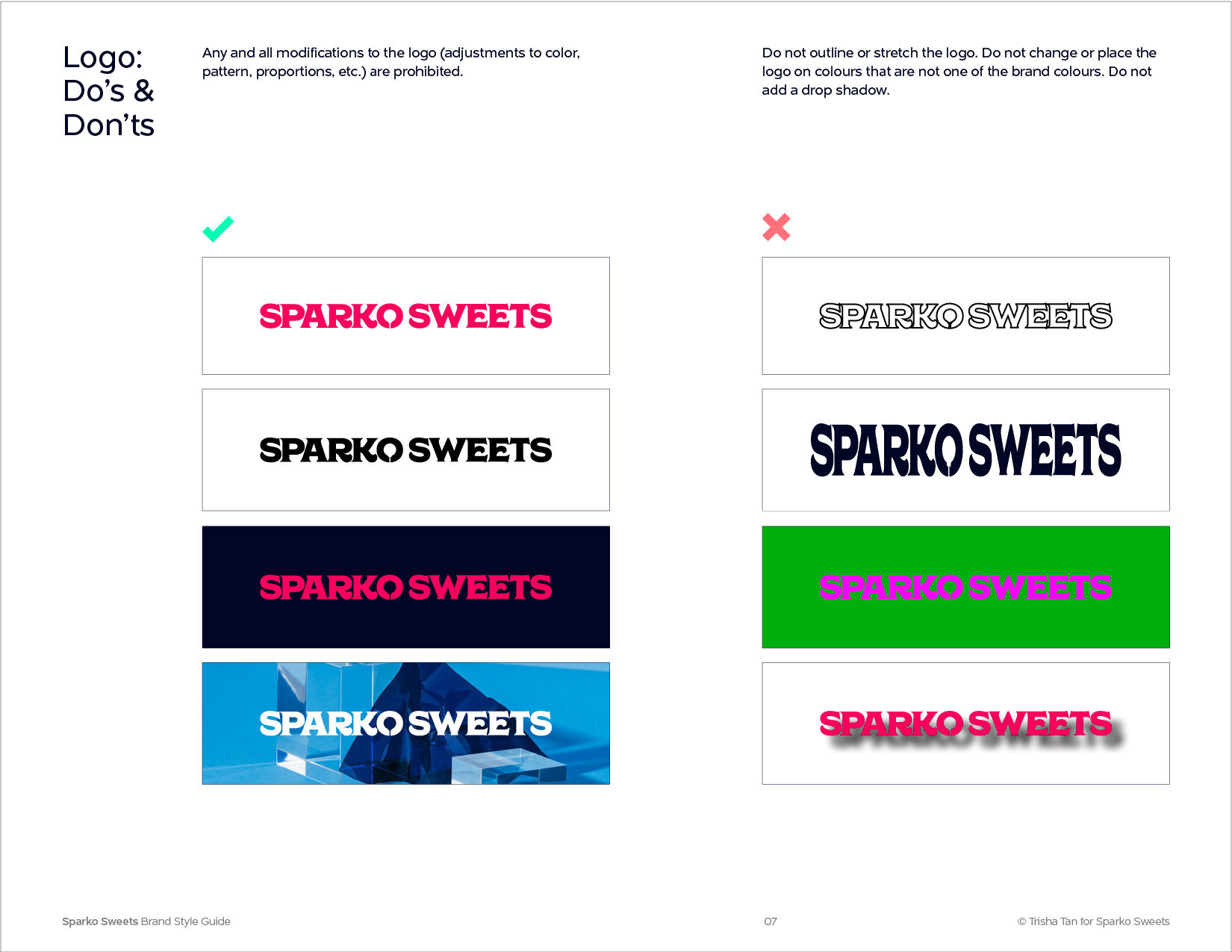
The Sparko Sweets new identity captures the evolution in a distinctive graphic wordmark logo designed to embody its identity and assures audiences of a strong connection to the brand. The logo features a typographic lockup in the typeface Regina Black, designed by Charles & Thorn, chosen for its heavy typeface that is influenced in equal parts by the elegant design from the early 1900’s and the chunky, friendly typefaces popularized in the 1970’s. The name has equal number of letters in each word, so it has been custom kerned to balance weight with scale. The core product, the galaxy lollipop, is seen in the negative space inside the letter O’s counter space, creating a visual irreverence into the identity.
Logo
The GalaxyPop is the brands’ most iconic product and exists in its original logo identity. The update enhances this logo to its key elements by refining the typographic forms. Balancing its proportions and construction of its letterforms, we fit the lollipop perfectly onto the counter of the O, preserving its quirkinesses but making it modern. The letters align with the number of characters in its name, complimenting the striking visual balance and bold anatomy of the typeface.
Icon
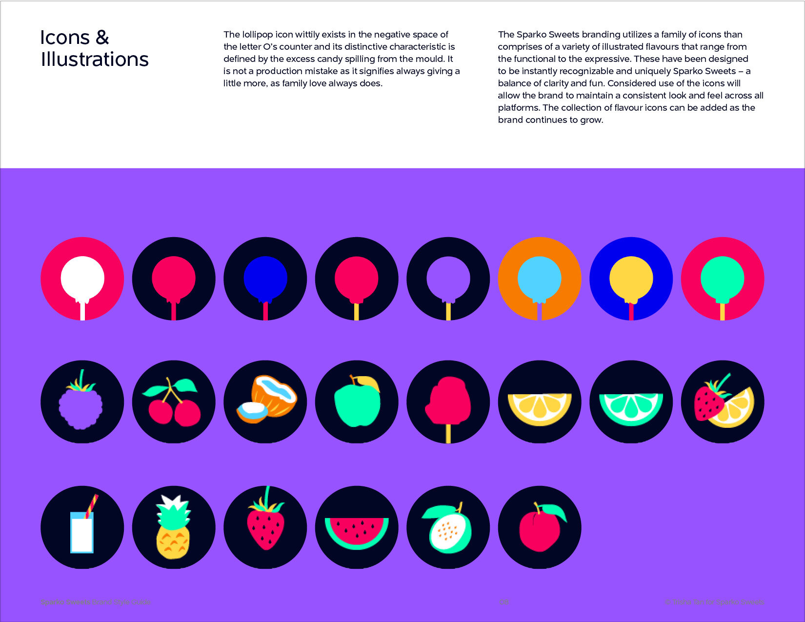
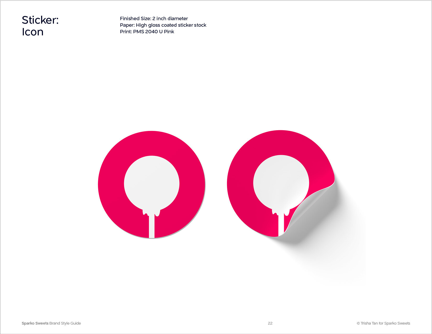
The lollipop icon wittily exists in the negative space of the letter O’s counter and its distinctive characteristic is defined by the excess candy spilling from the mould. It is not a production mistake as it signifies always giving a little more, as family love always does.
Icon Graphic System
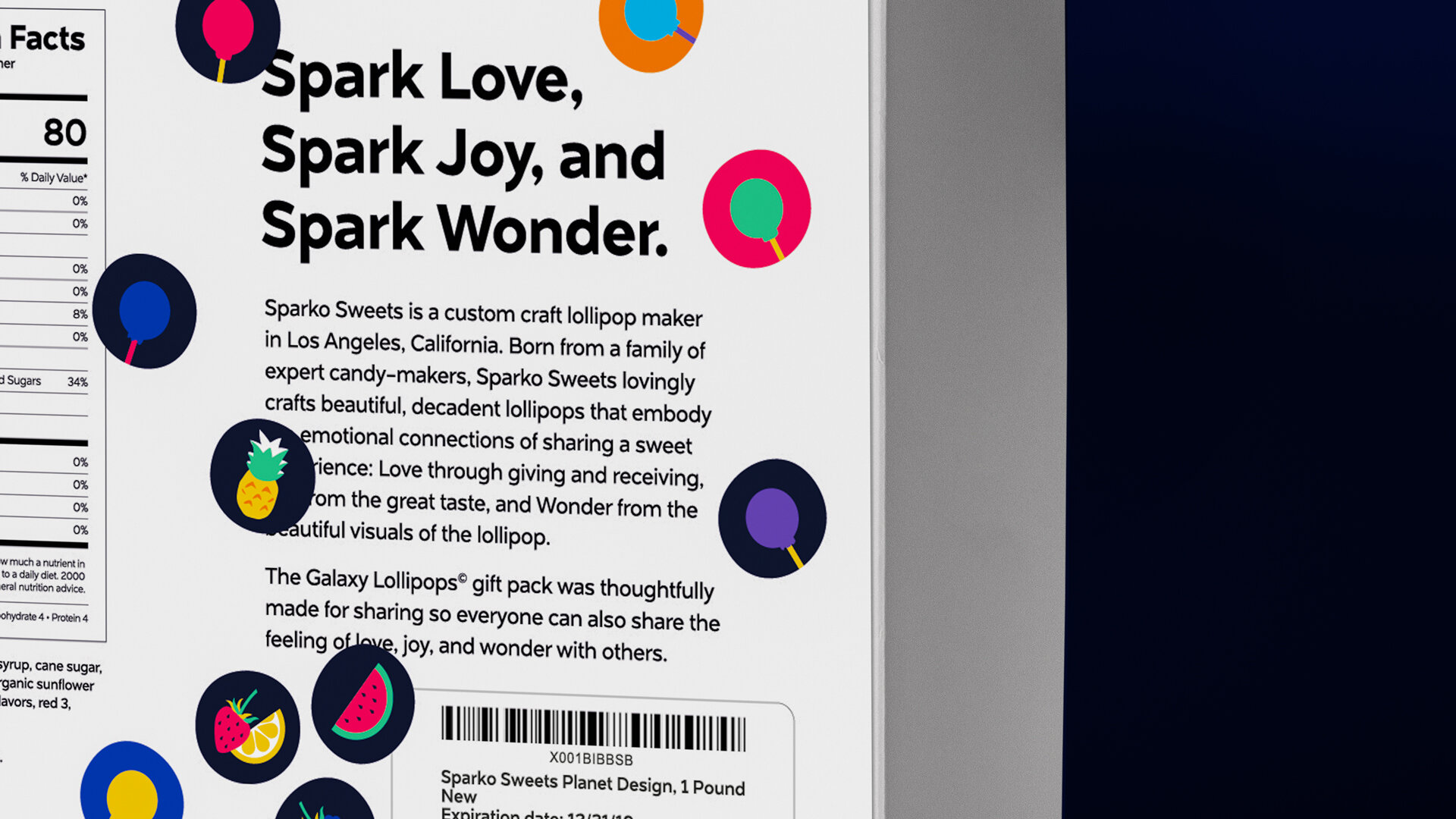
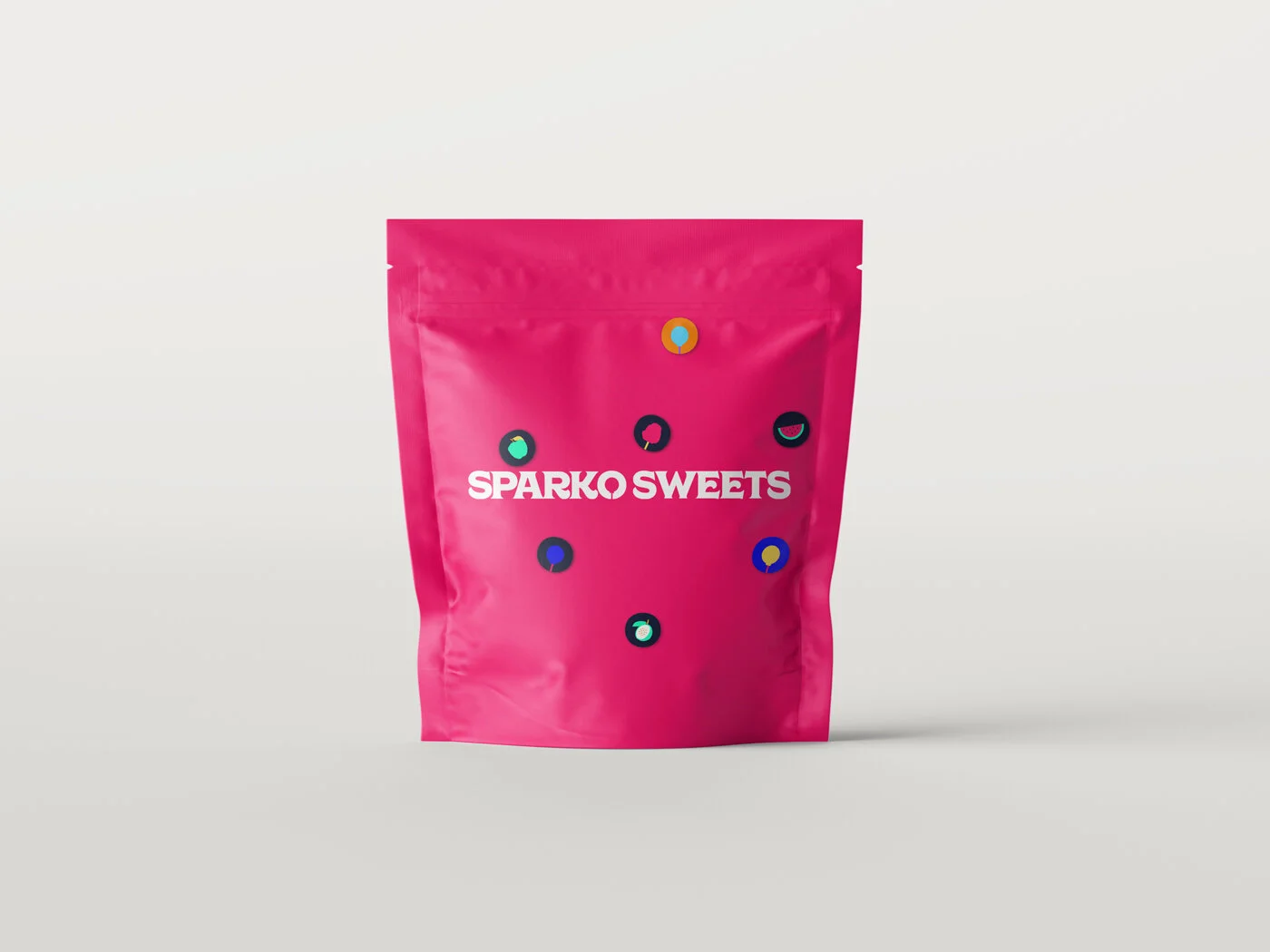
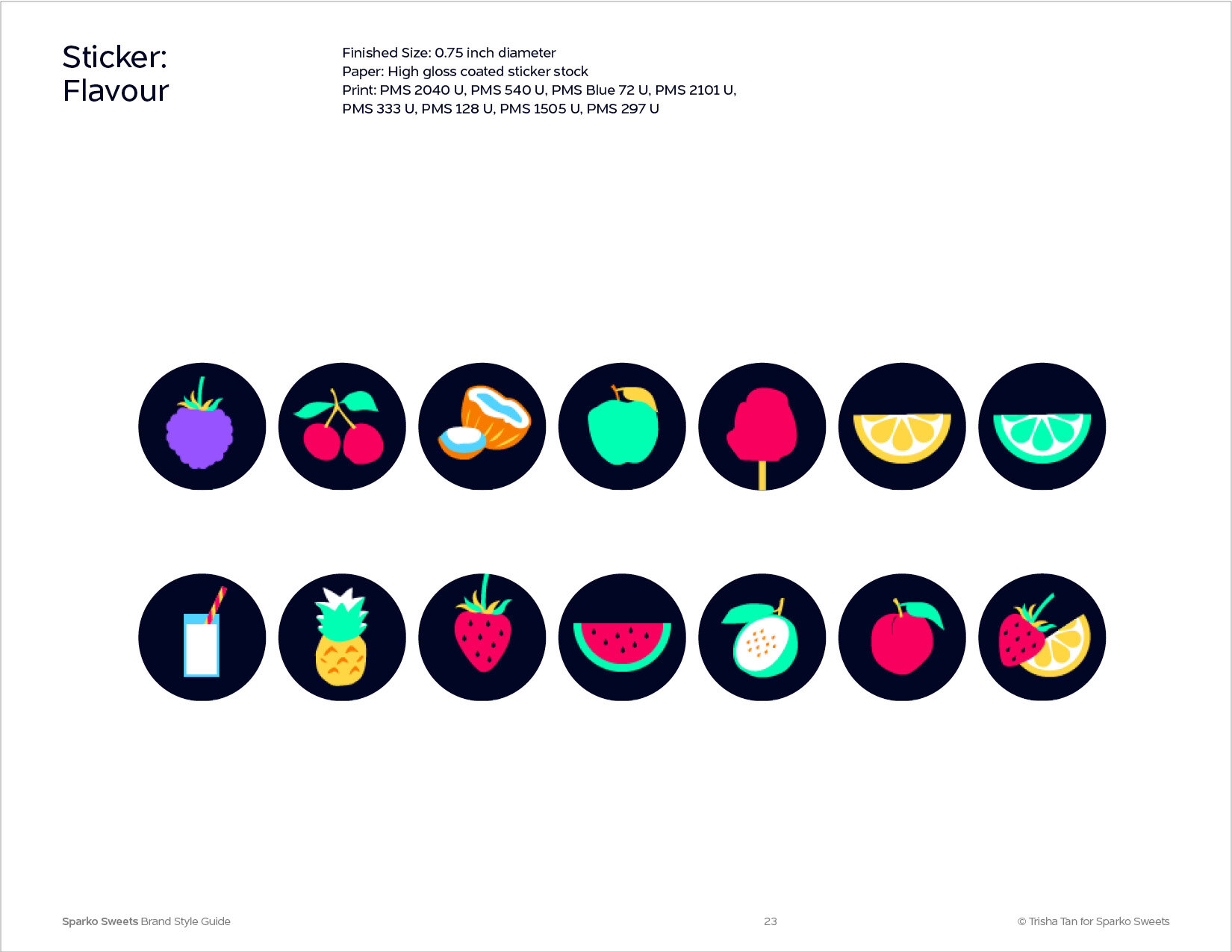
The Sparko Sweets branding utilizes a family of icons than comprises of a variety of illustrated flavours that range from the functional to the expressive. These have been designed to be instantly recognizable and uniquely Sparko Sweets – a balance of clarity and fun. These icons have been designed as a variety of stickers adhered to the exterior box packaging.
Typography
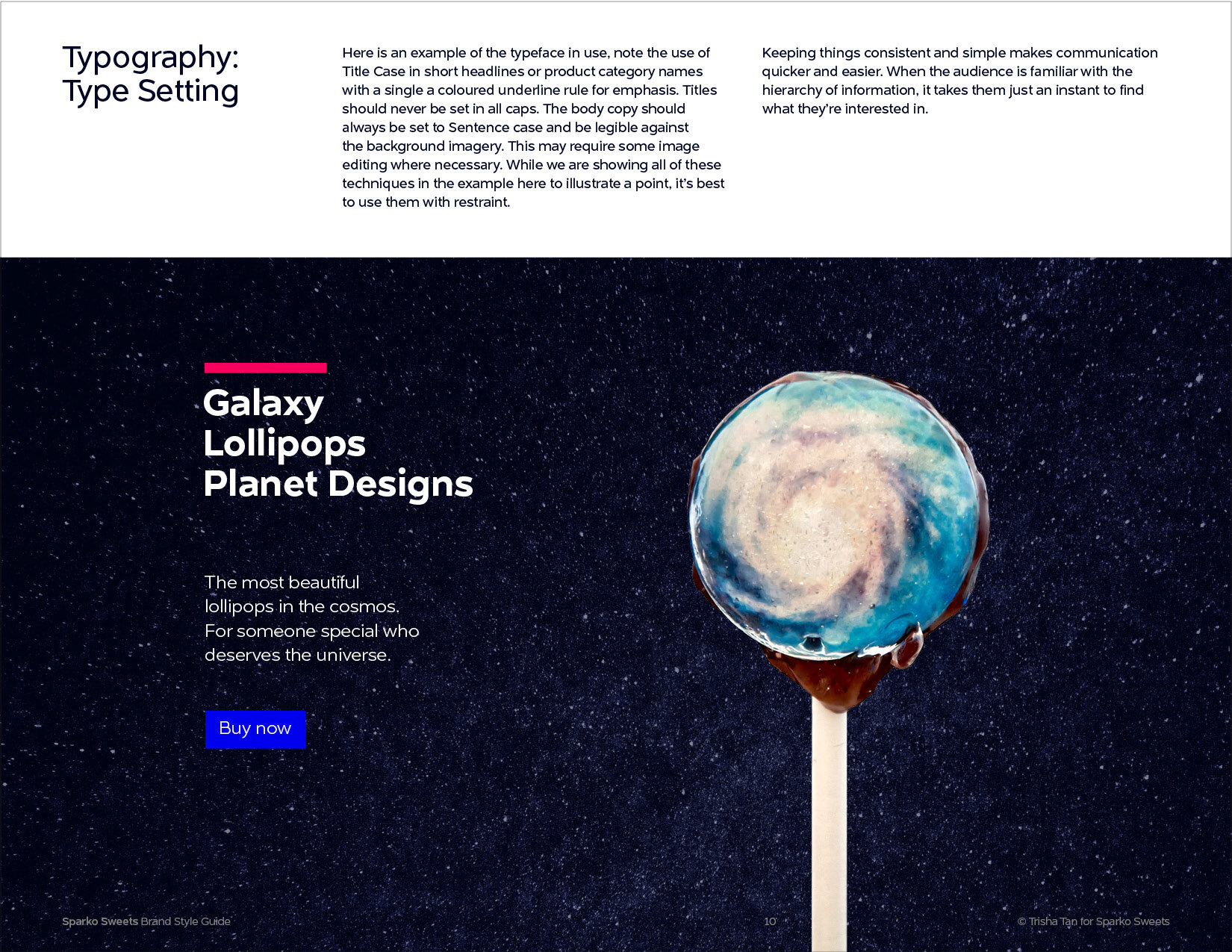
Together, both typefaces embody a vibrant duality in the pairing. While Regina Black is exclusively used for the logo lockup, all other typographic collaterals are set with Naste to maintain the visual hierarchy of importance for the brand identity.
Packaging Design
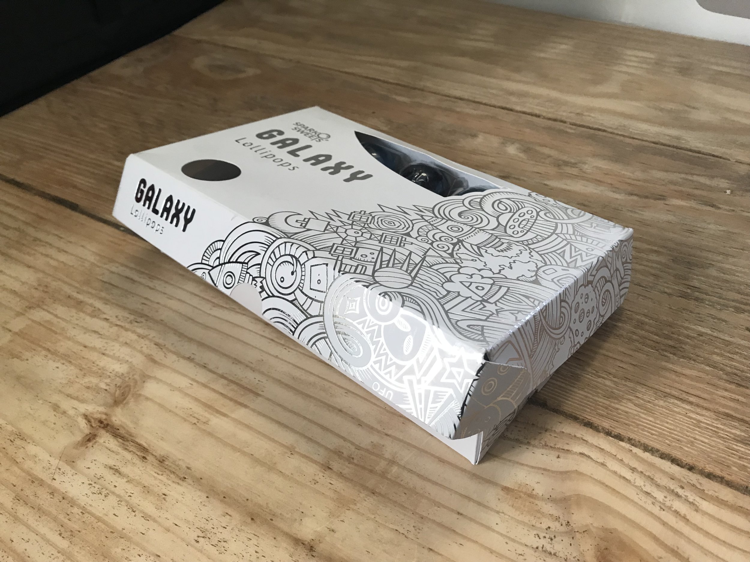
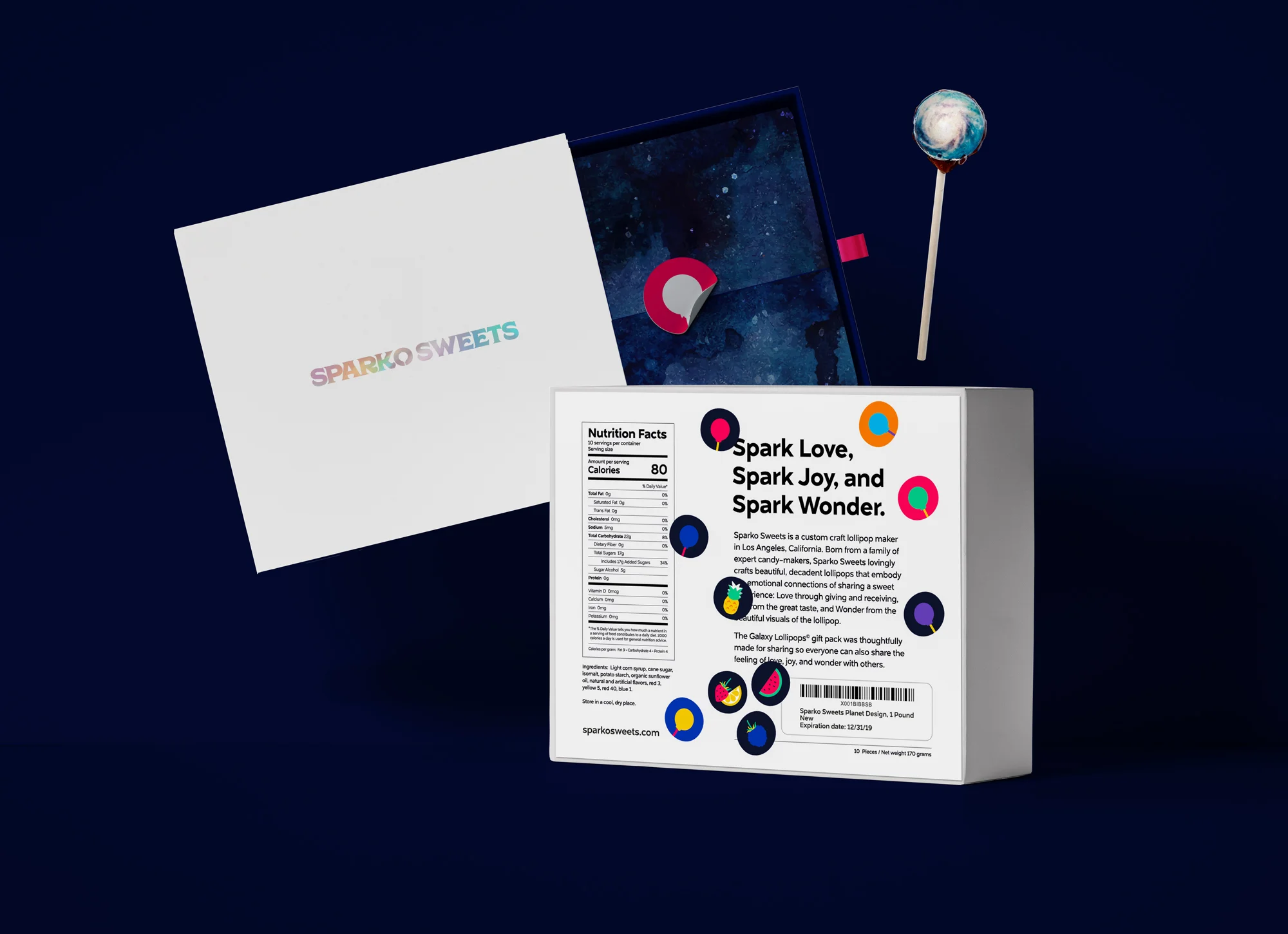
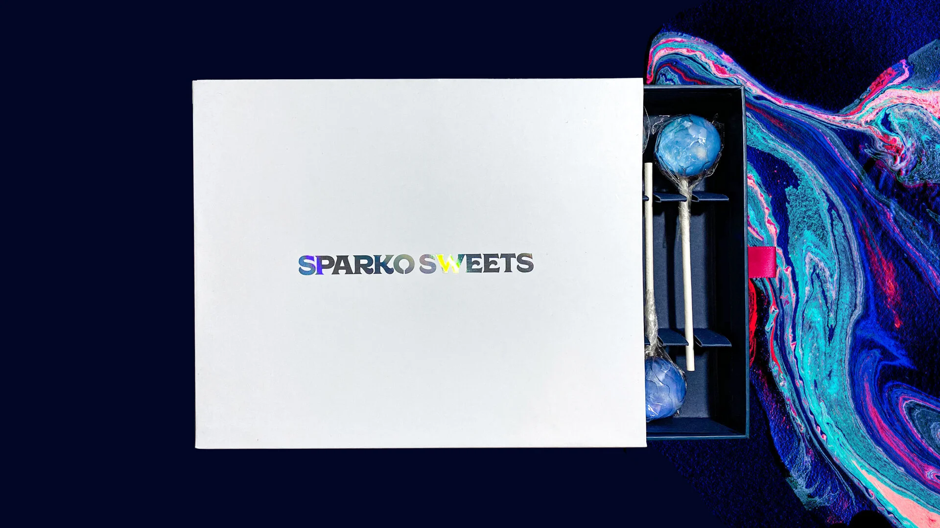
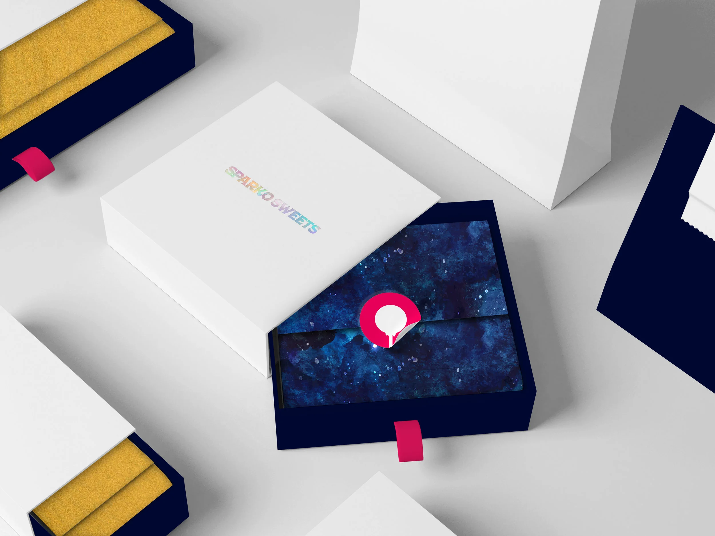
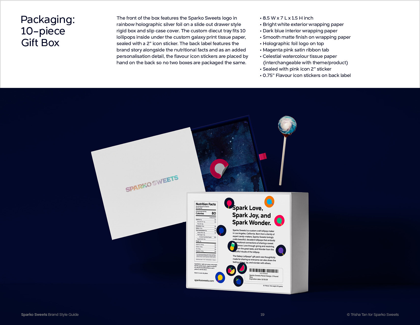
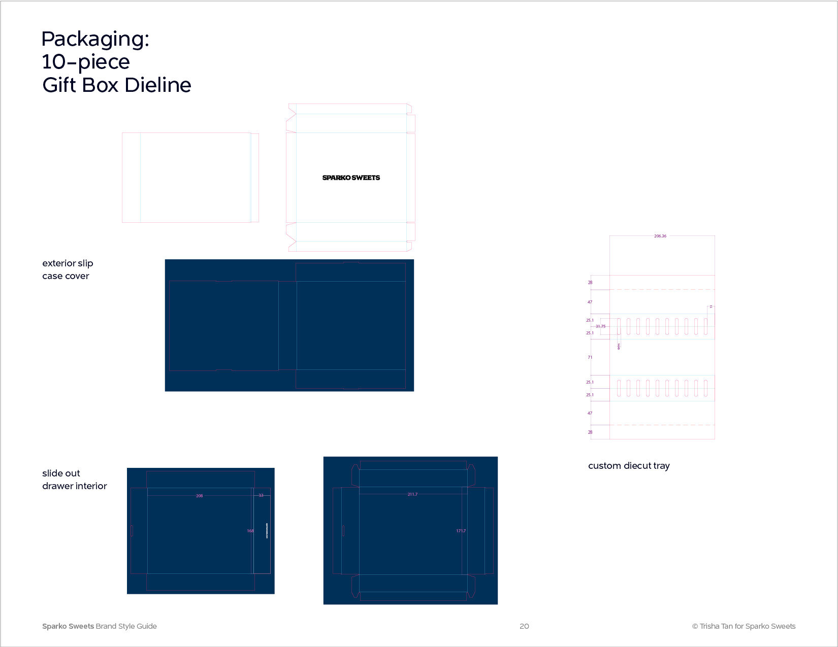
The new packaging design featuring a slide-out drawer style box with a rainbow holographic foiled logo, satin pink ribbon pull tab, galaxy print tissue paper liner, and hot pink icon sticker. Gold tissue liners for the natural range.
Photography Art Direction
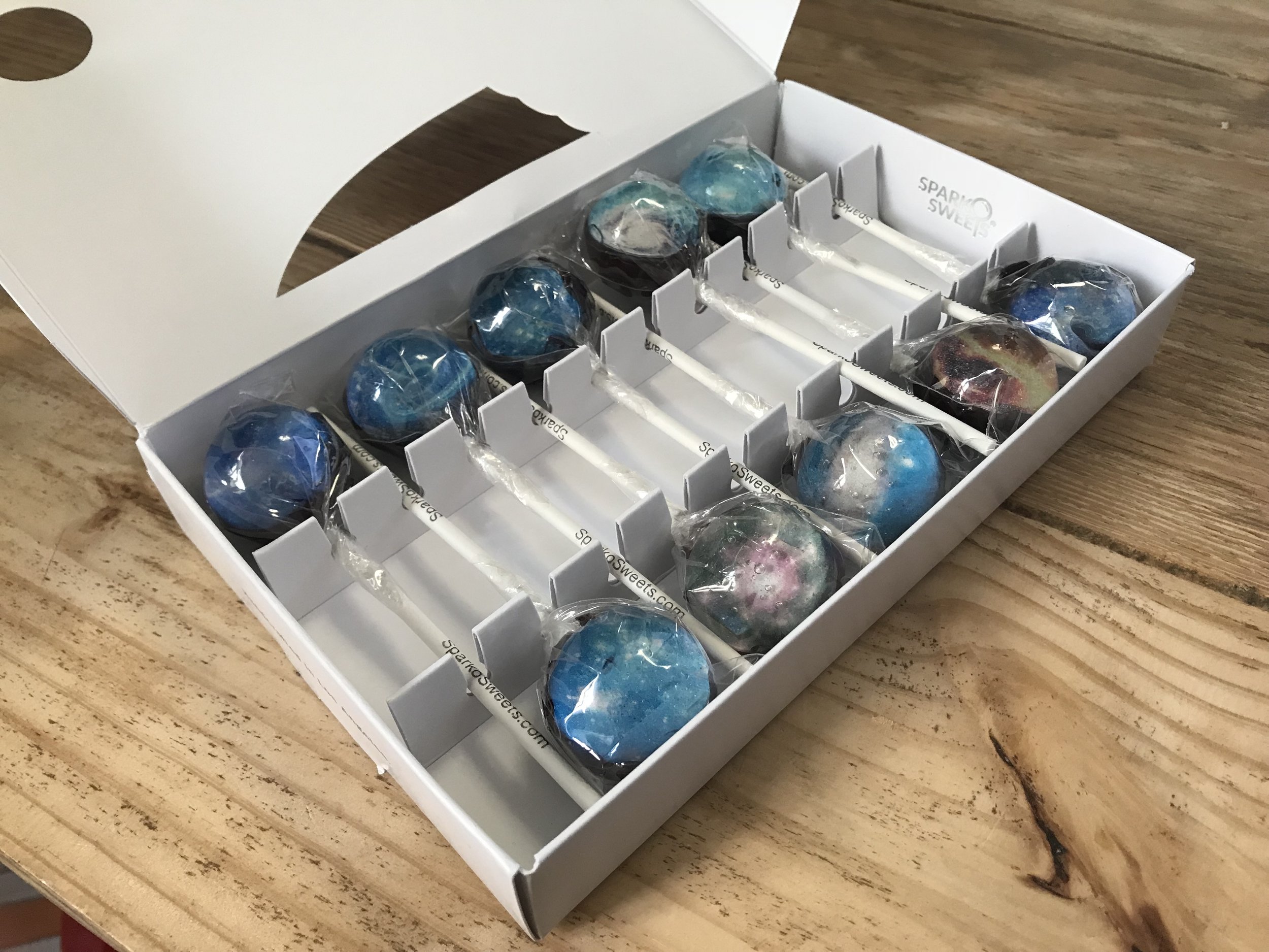
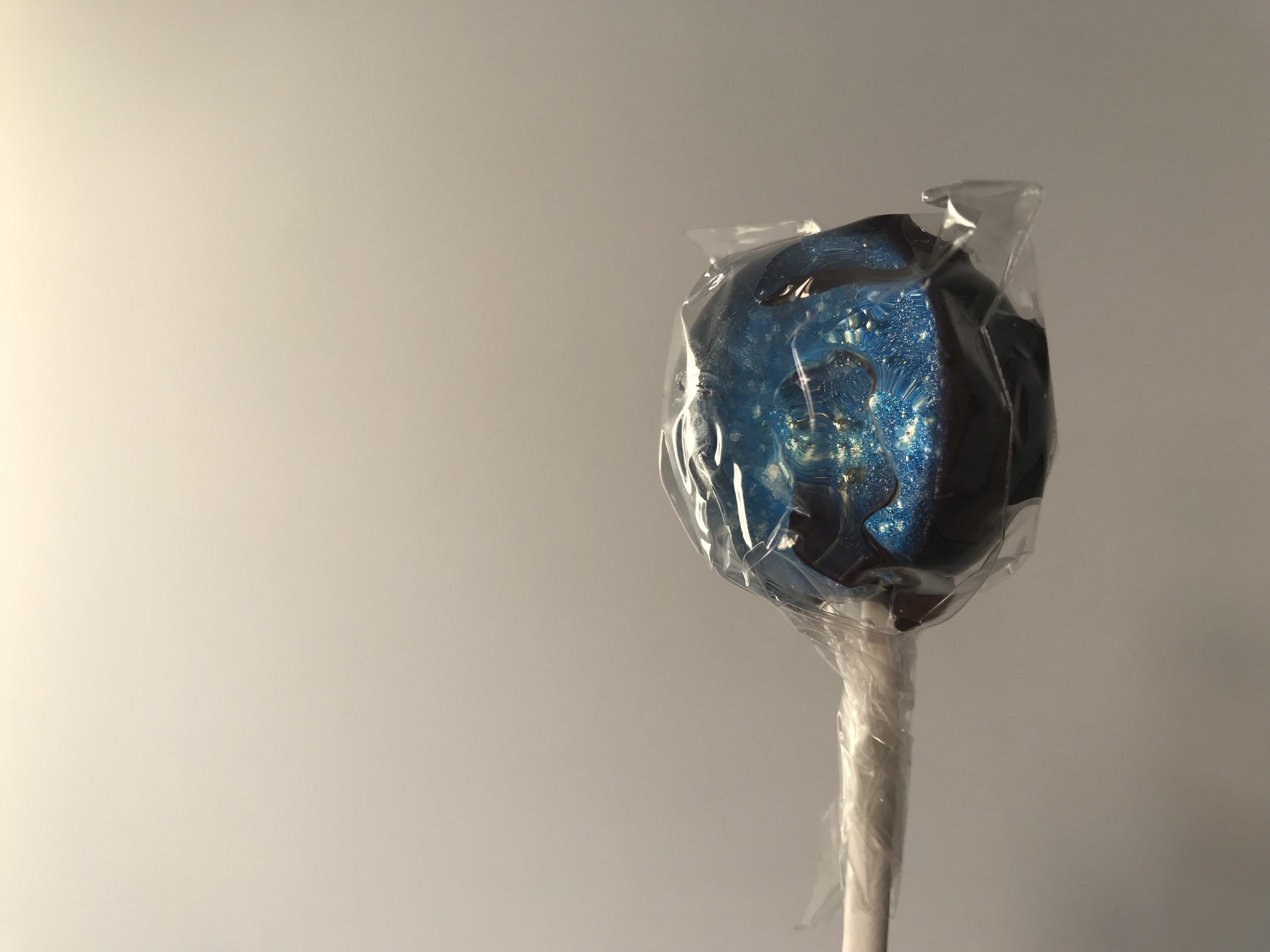
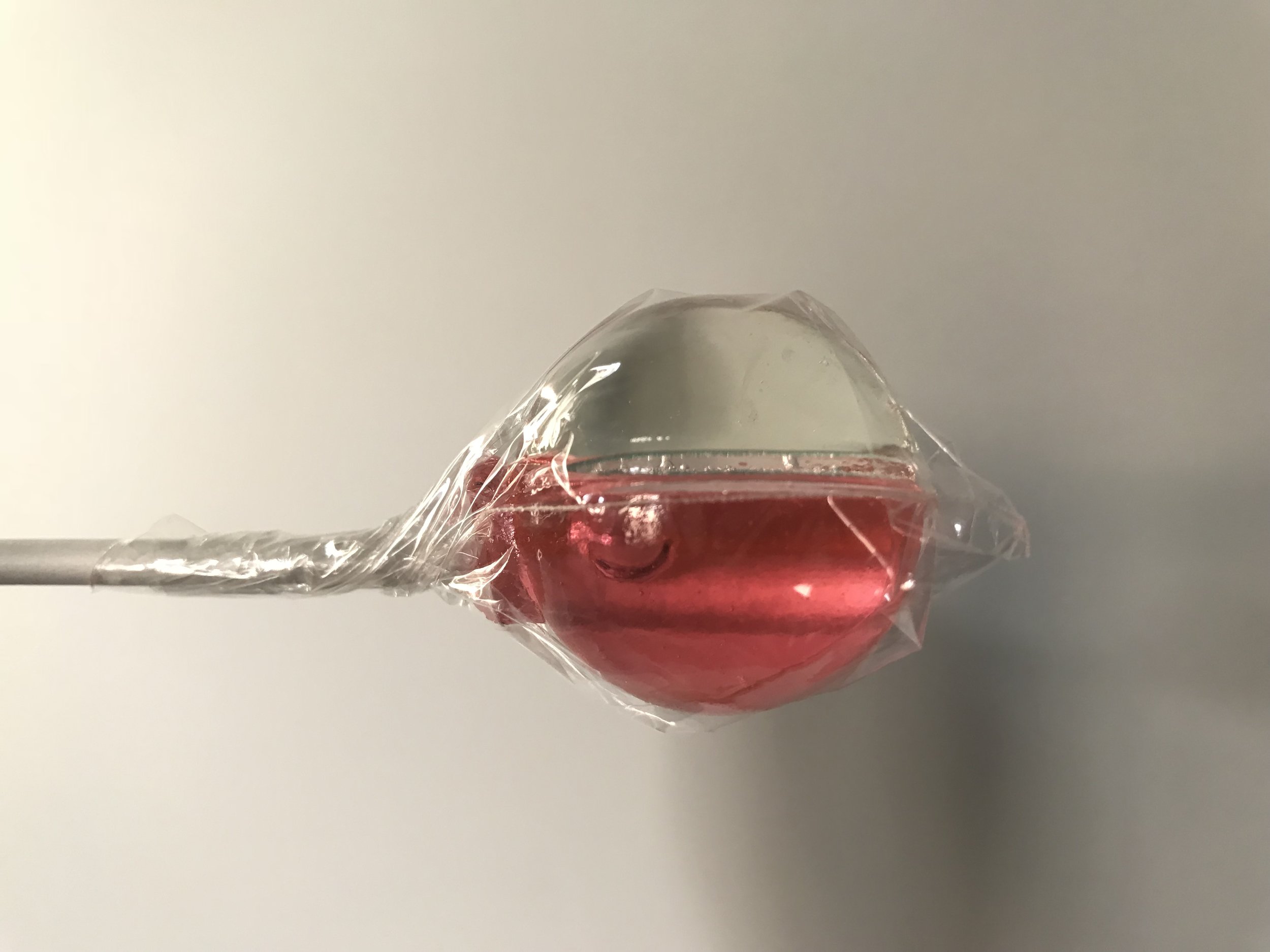
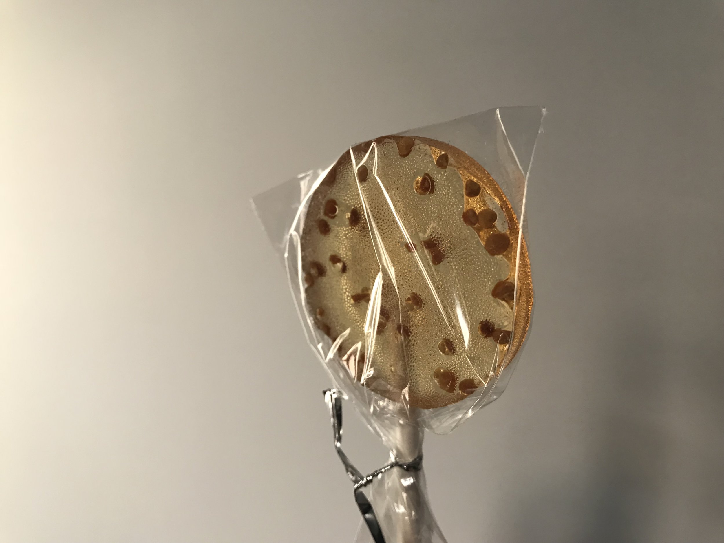
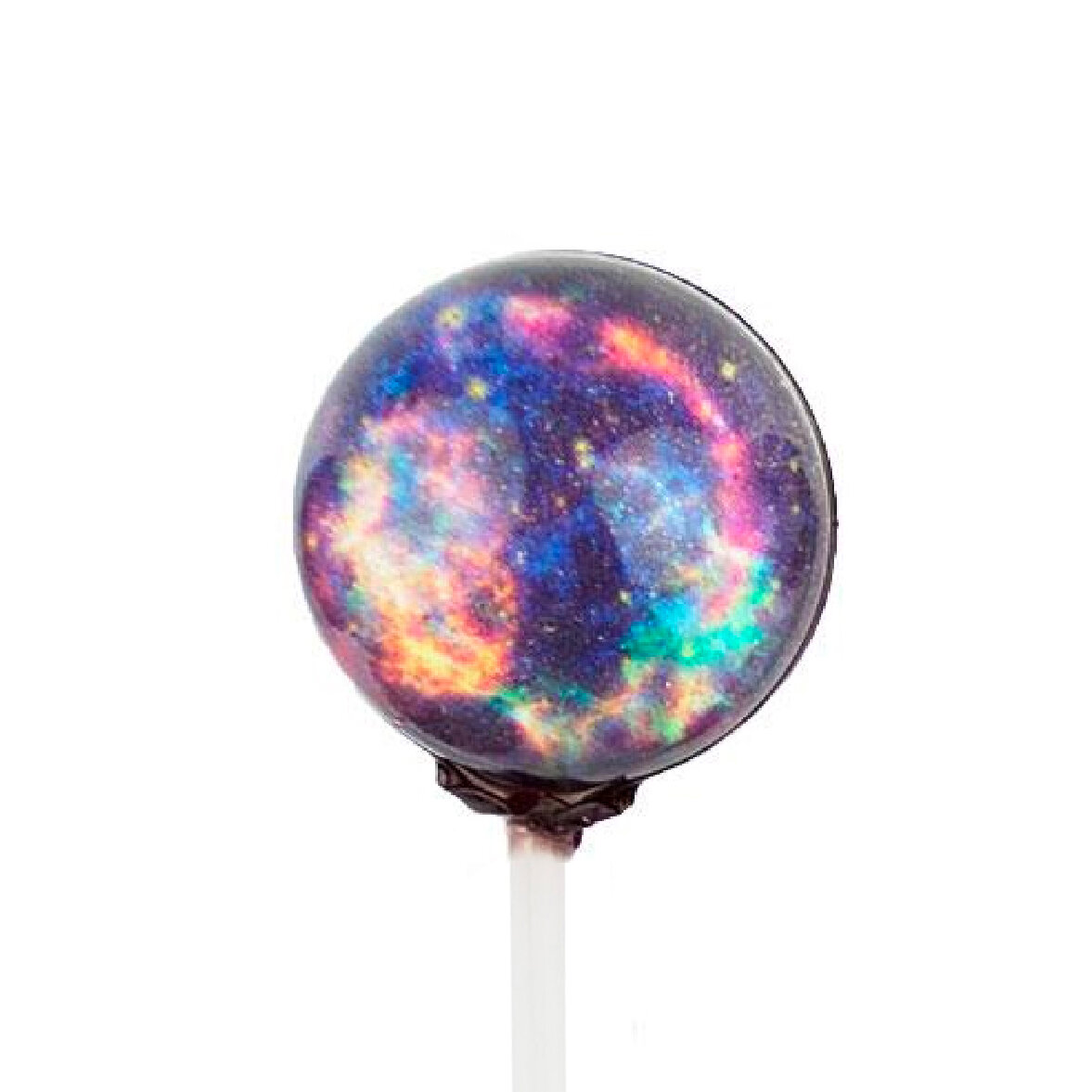
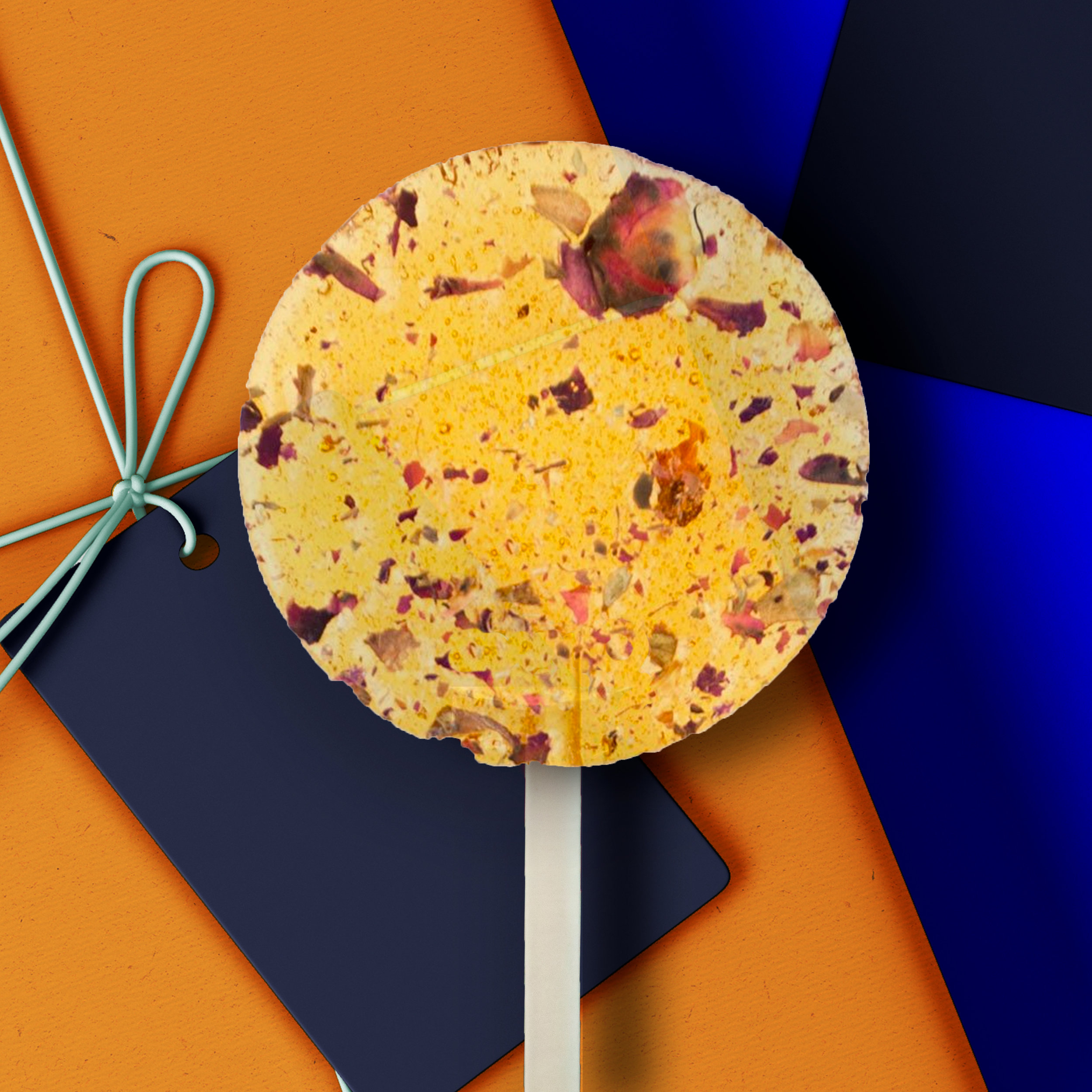
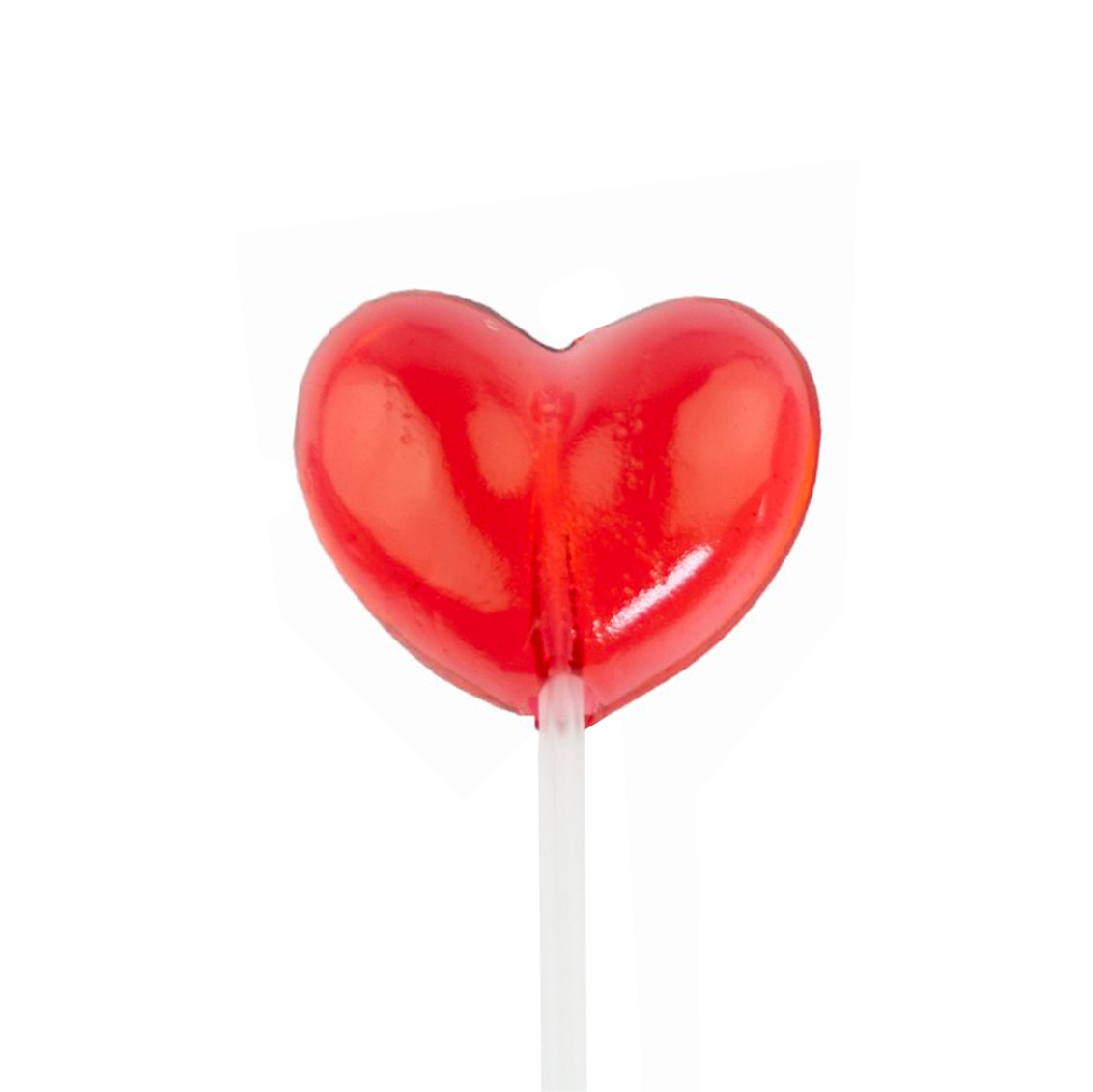
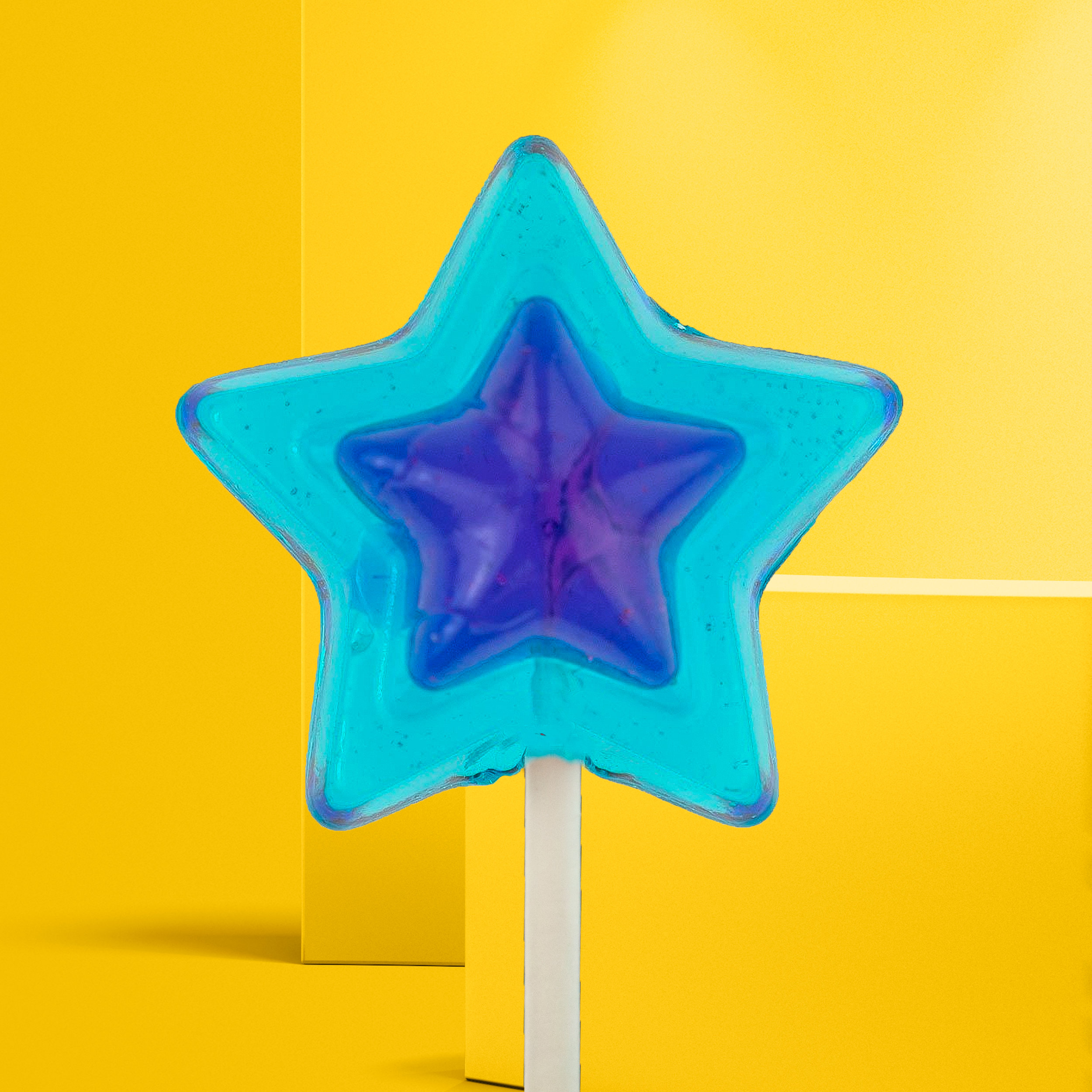
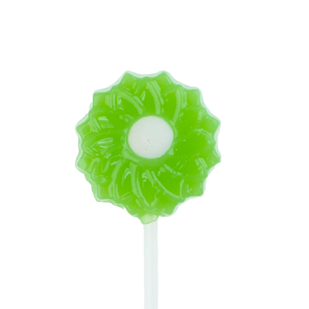
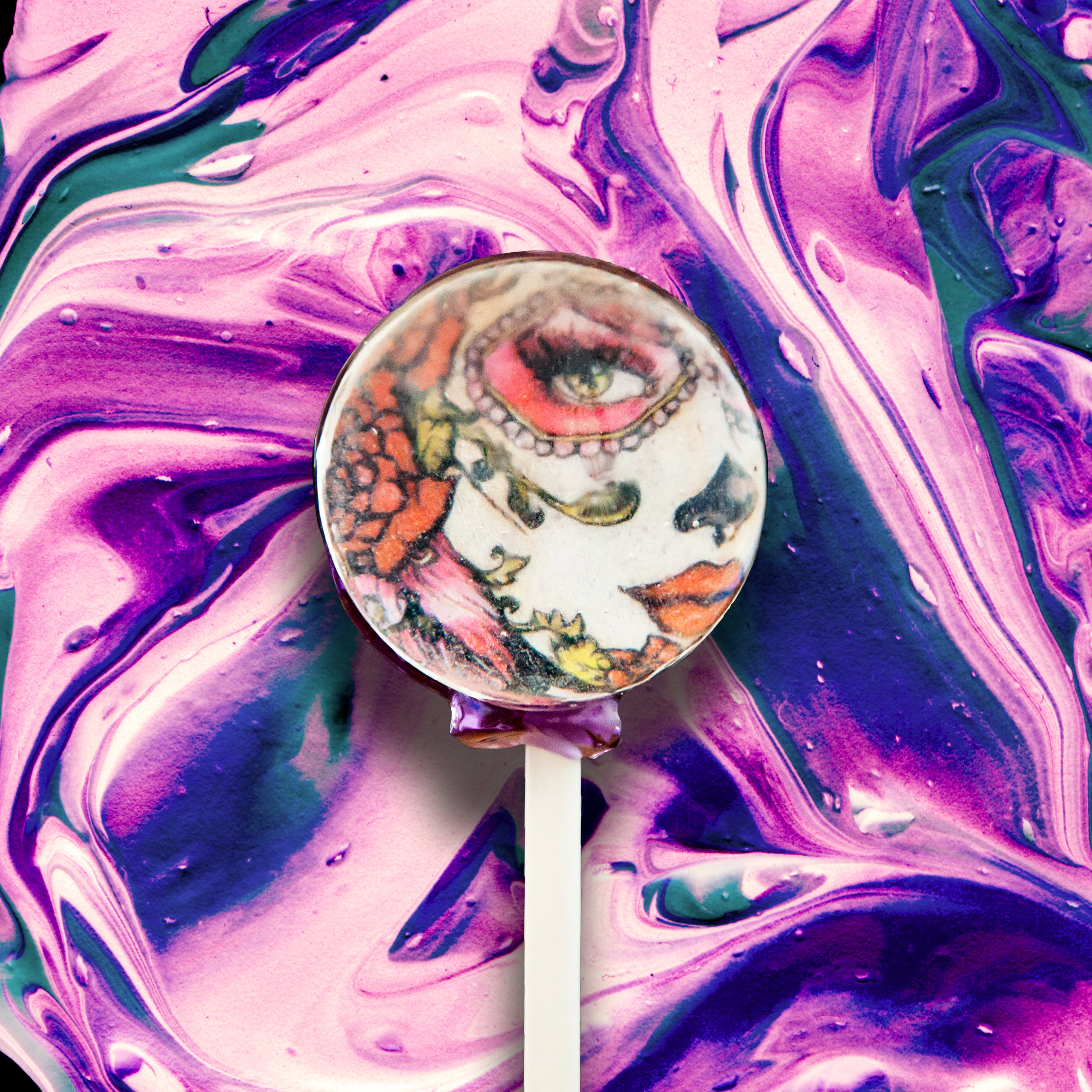
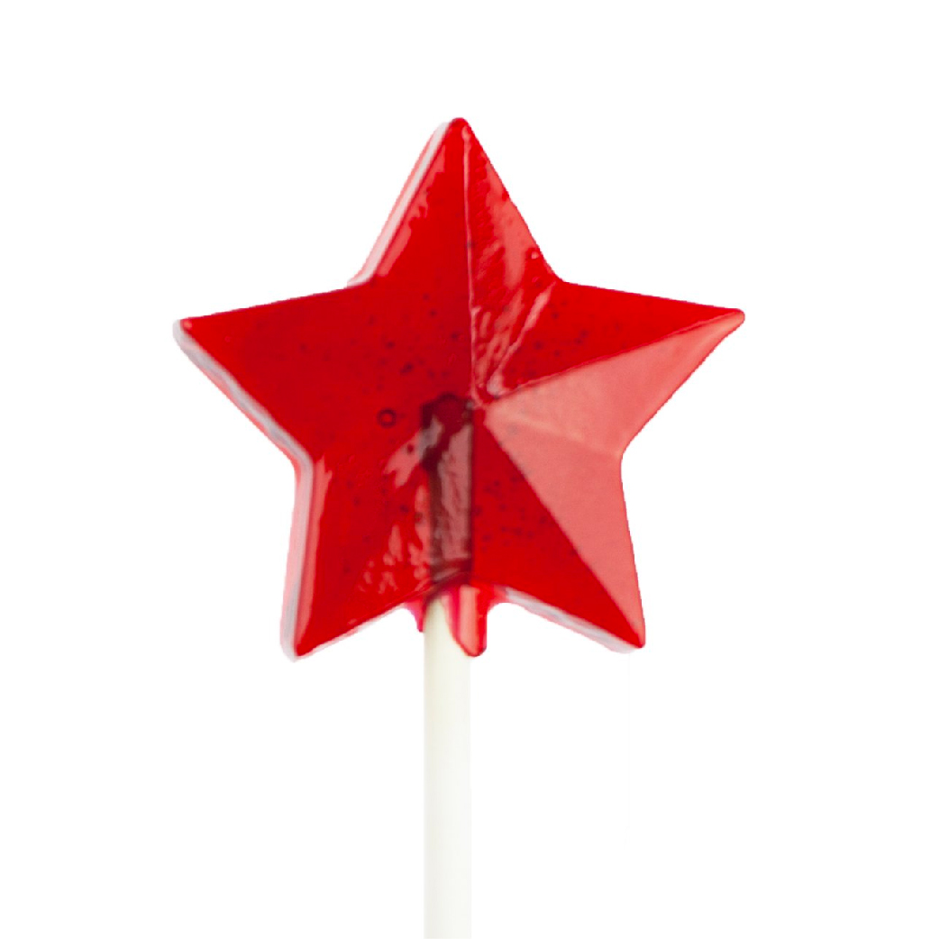
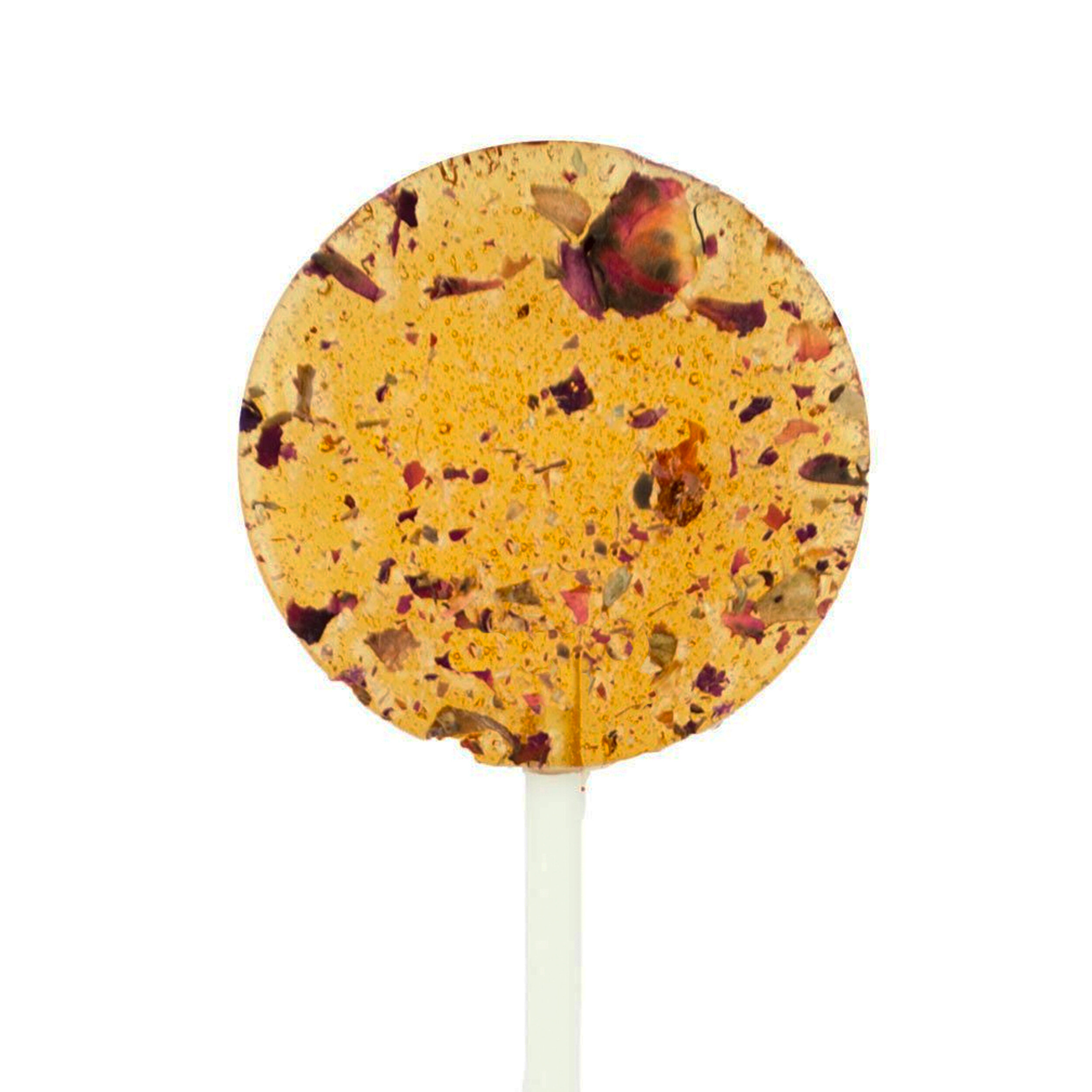
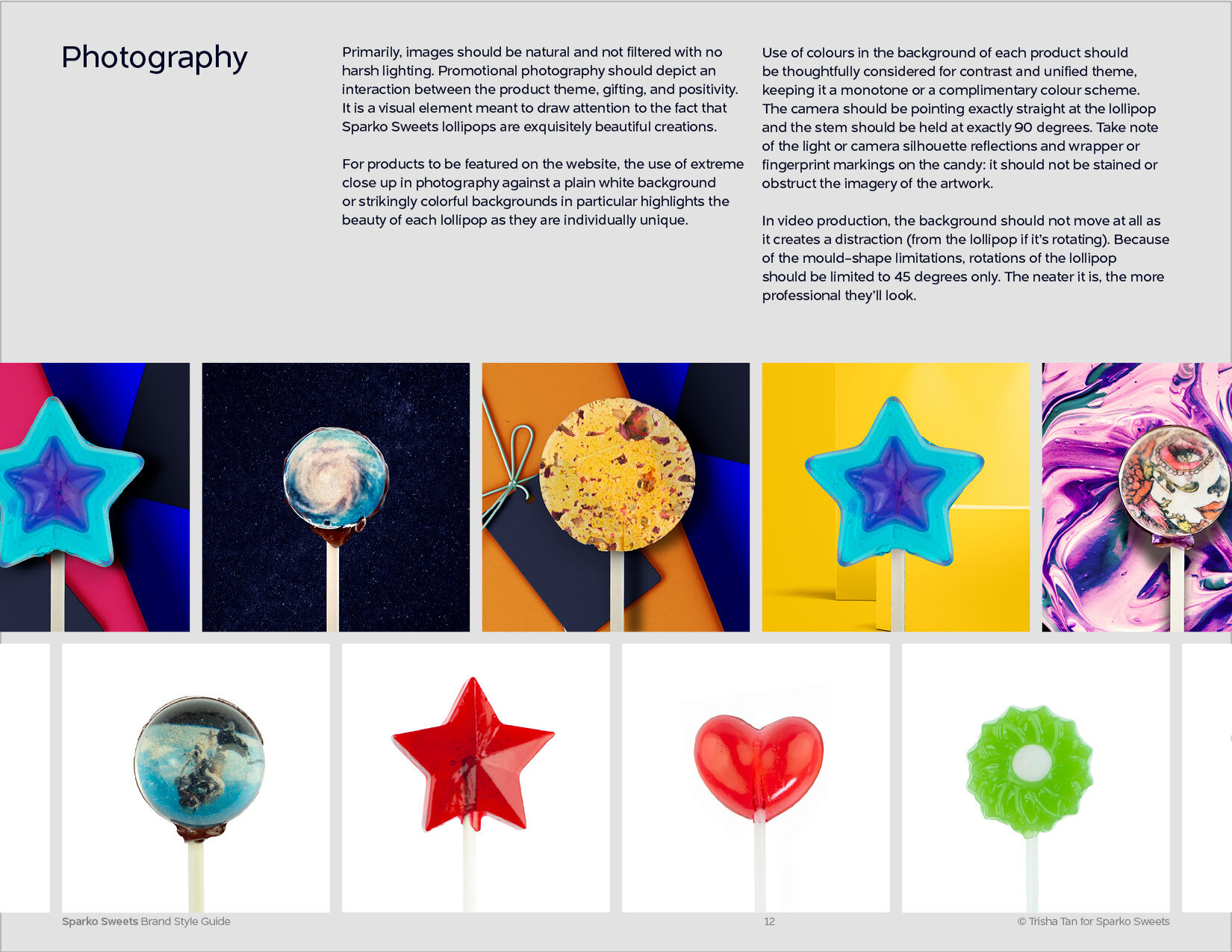
Sparko Sweets is beautiful—show off the beauty of the product! While the galaxy is out of reach, being able to see a planet upclose is pretty special.
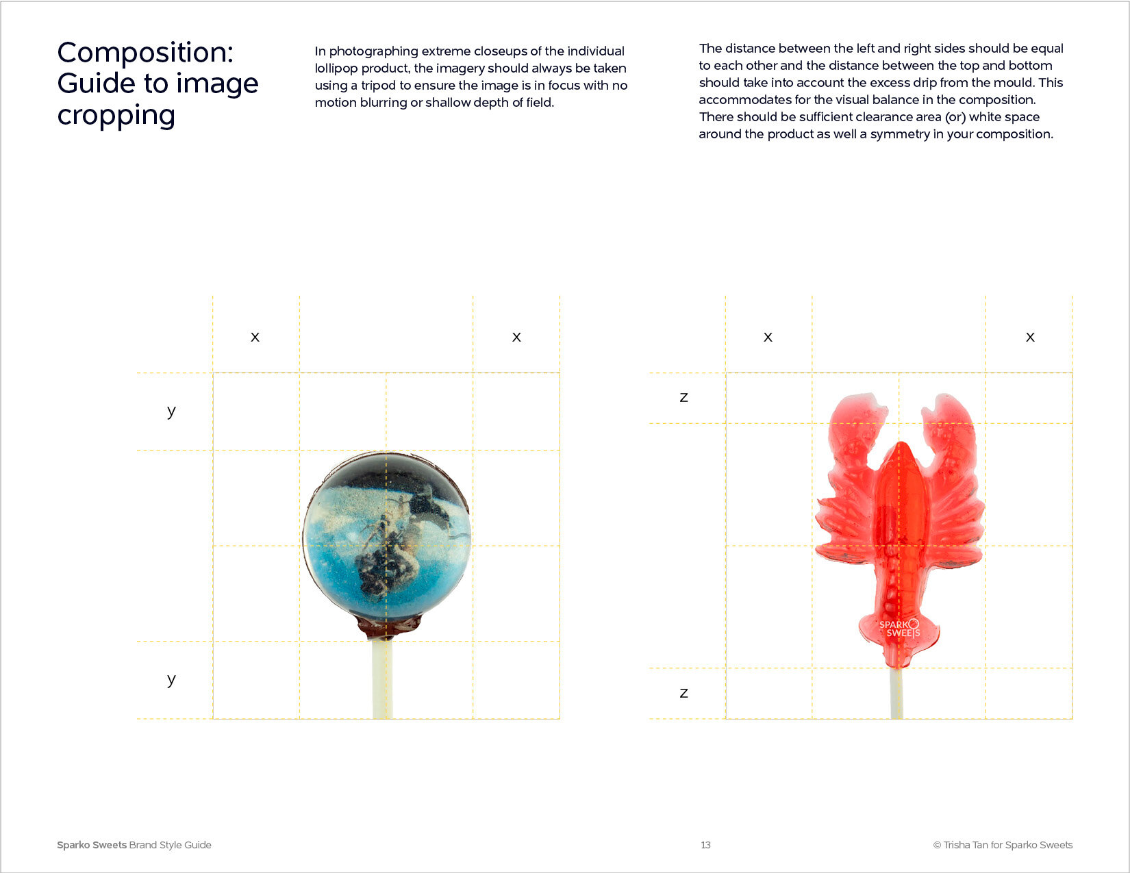
Consistent, close-up photography of each lollipop (not grouped) enables users to fully appreciate the beauty and feel a sense of wonder to the creation. This will set Sparko Sweets apart from the generic competitors.
Stickers & Stationery
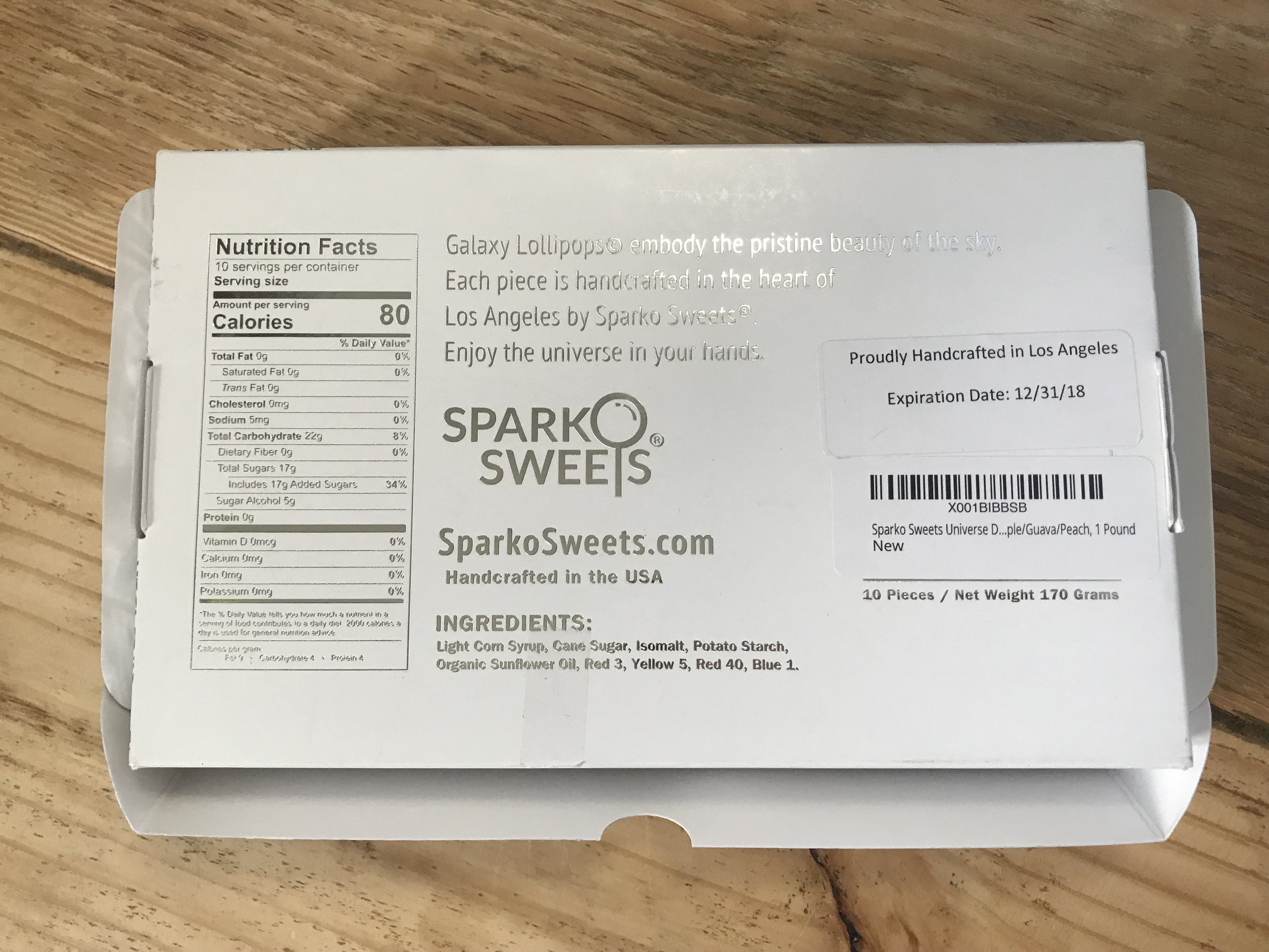
Back label of the new packaging box features the brand story. The icon and flavour stickers are manually adhered to insert a little fun, personalisation, and humour to the otherwise pristine exterior, ensuring each box is unique and packed with love.
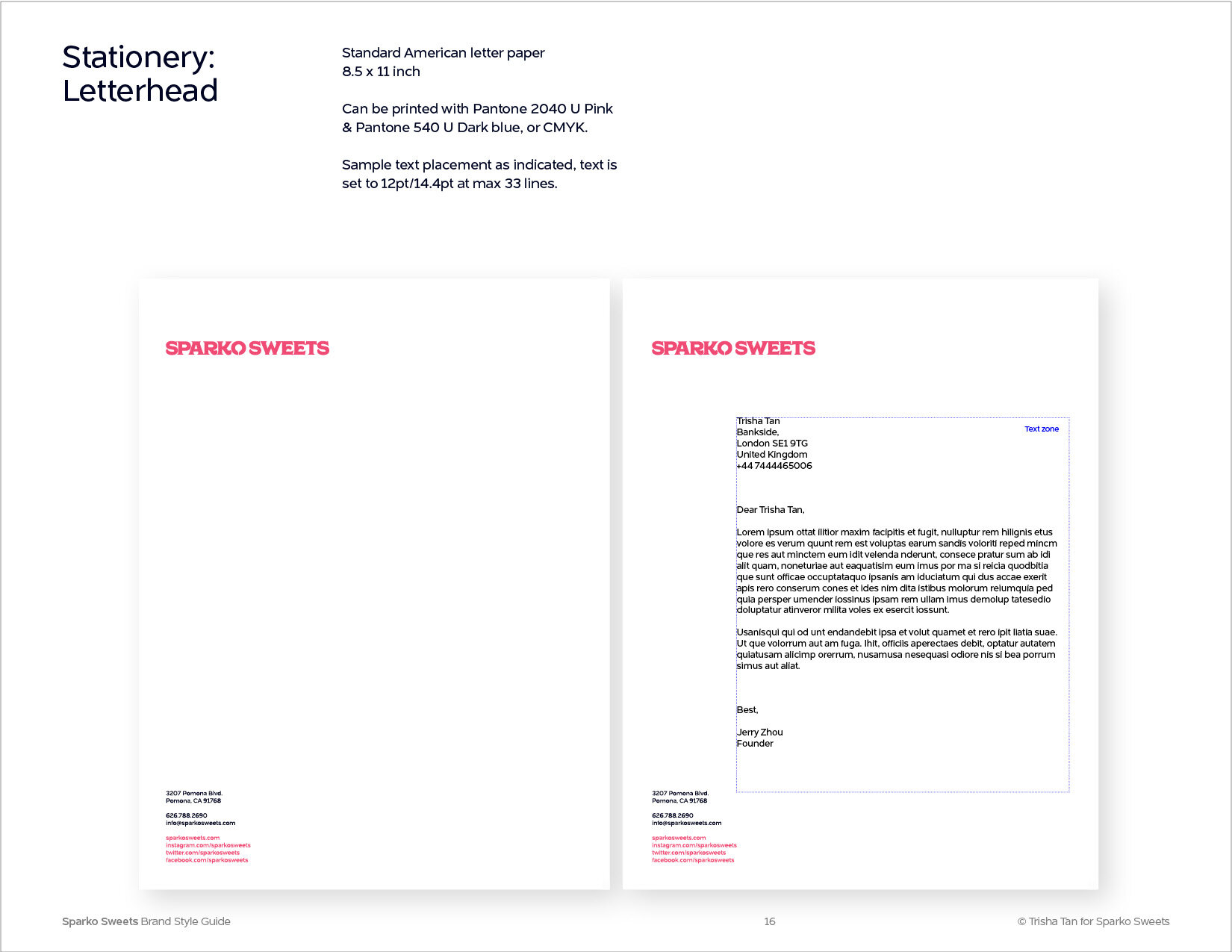
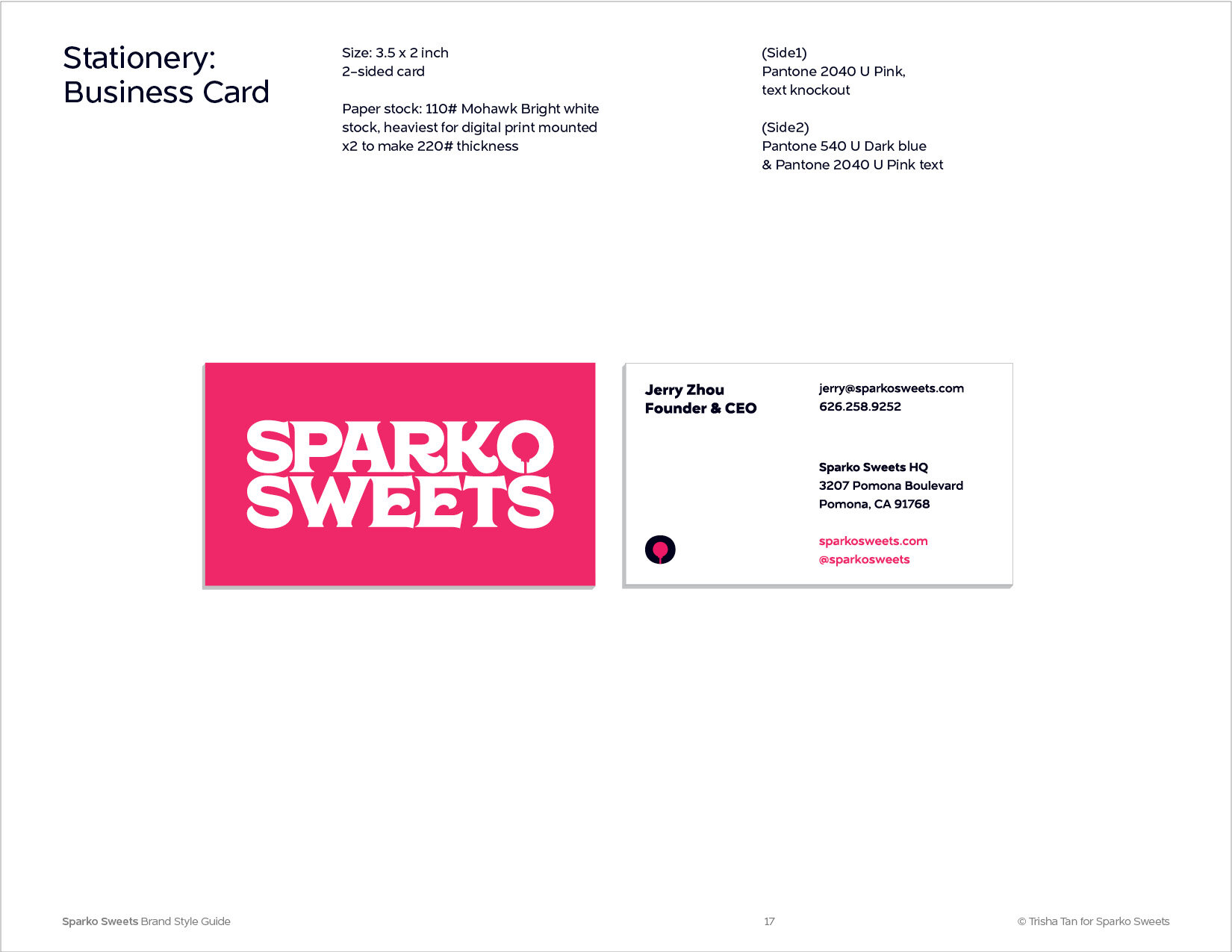
We designed a some business collaterals: Letterhead, business card, and a thank you correspondence card to be included into the packaging box to reinforce the brand story with every purchase.
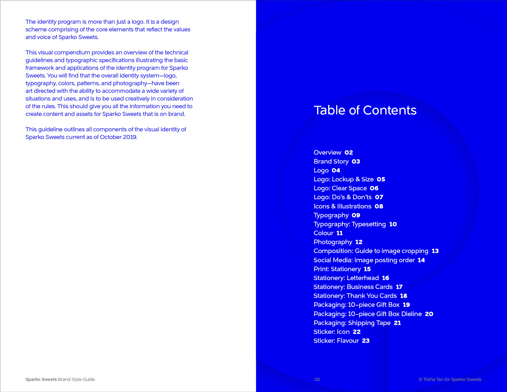
Brand System Guidelines
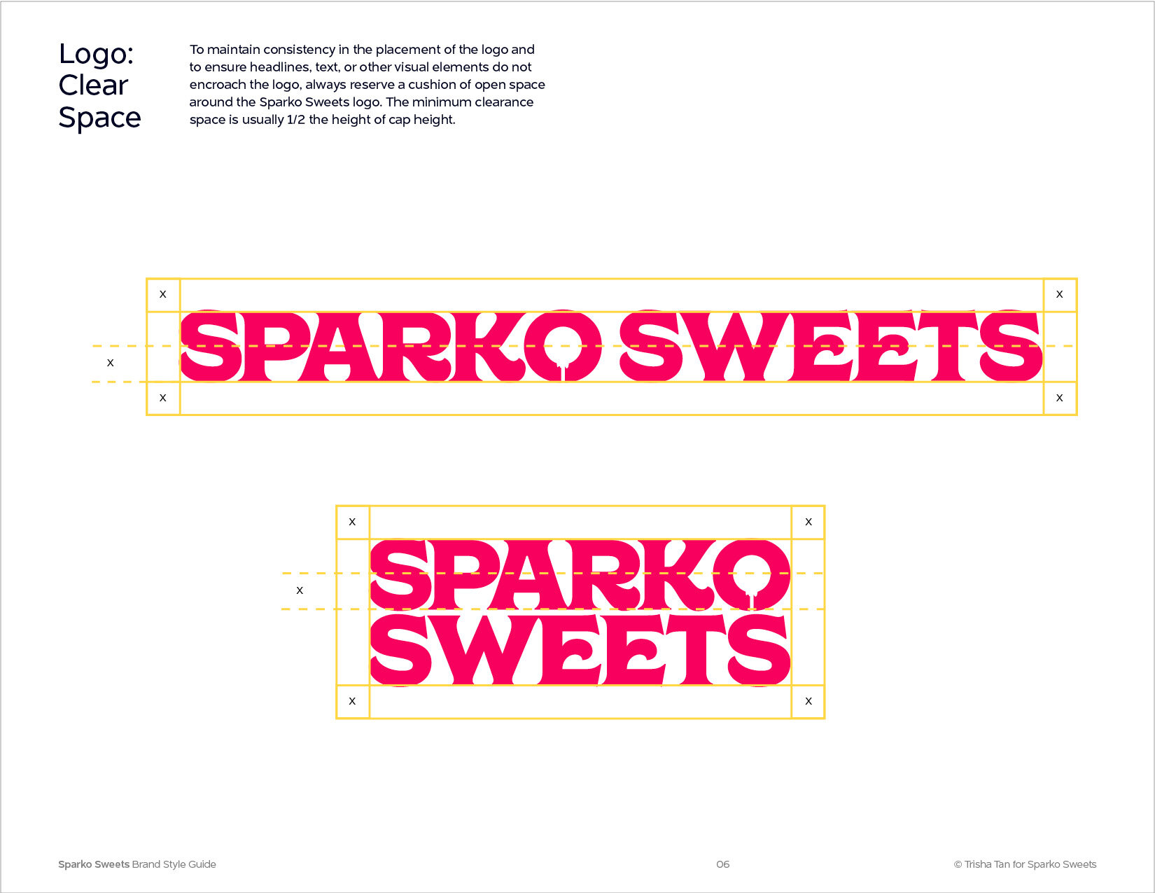
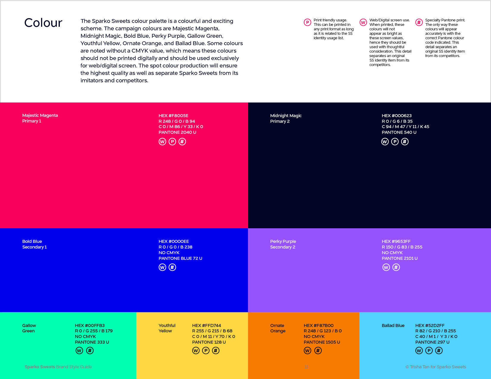
We created guidelines for the consistent implementation of the identity across all of the brands’ communications, with primary focus on the packaging’s visual identity, photography style, and social media presence. The design embodies the qualities that Sparko Sweets value in their brand— boldness, creativity, and community.
Browse the Style Guide below:


