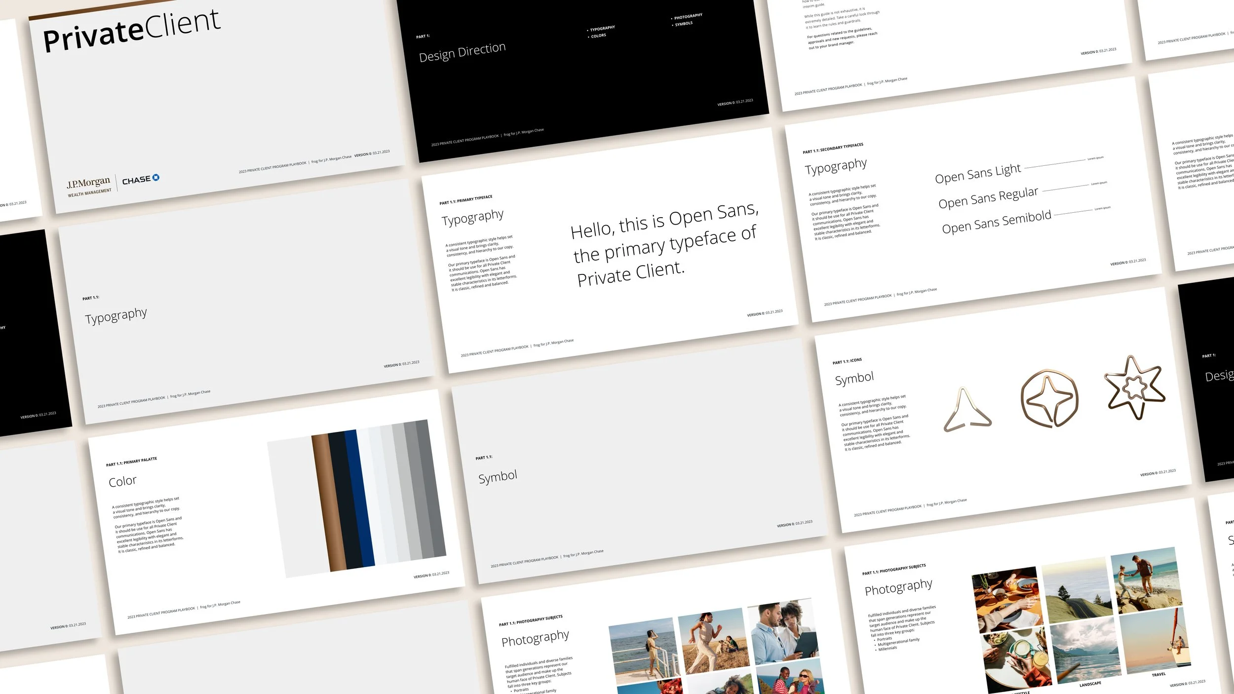
Visual identity directions for a new J.P. Morgan & Chase rewards program
frog partnered with various JPMC brand teams to create the messaging system and design three distinct visual identity directions for a new rewards program, Private Client, that would fall under both Chase and J.P. Morgan.
In this program, I helped the program lead execute and guide our visual designers collect brand materials and web research, synthesise voice of customer research, compile inspiration moodboards, and generate conceptual design ideas through high fidelity prototypes and visualisations to present with our client stakeholders.
Brand Design
Brand Strategy
Visual Identity Design
Moodboard & Concepting
Presentation Design
Digital Design
Website Design
Interactive Prototyping
Motion Design
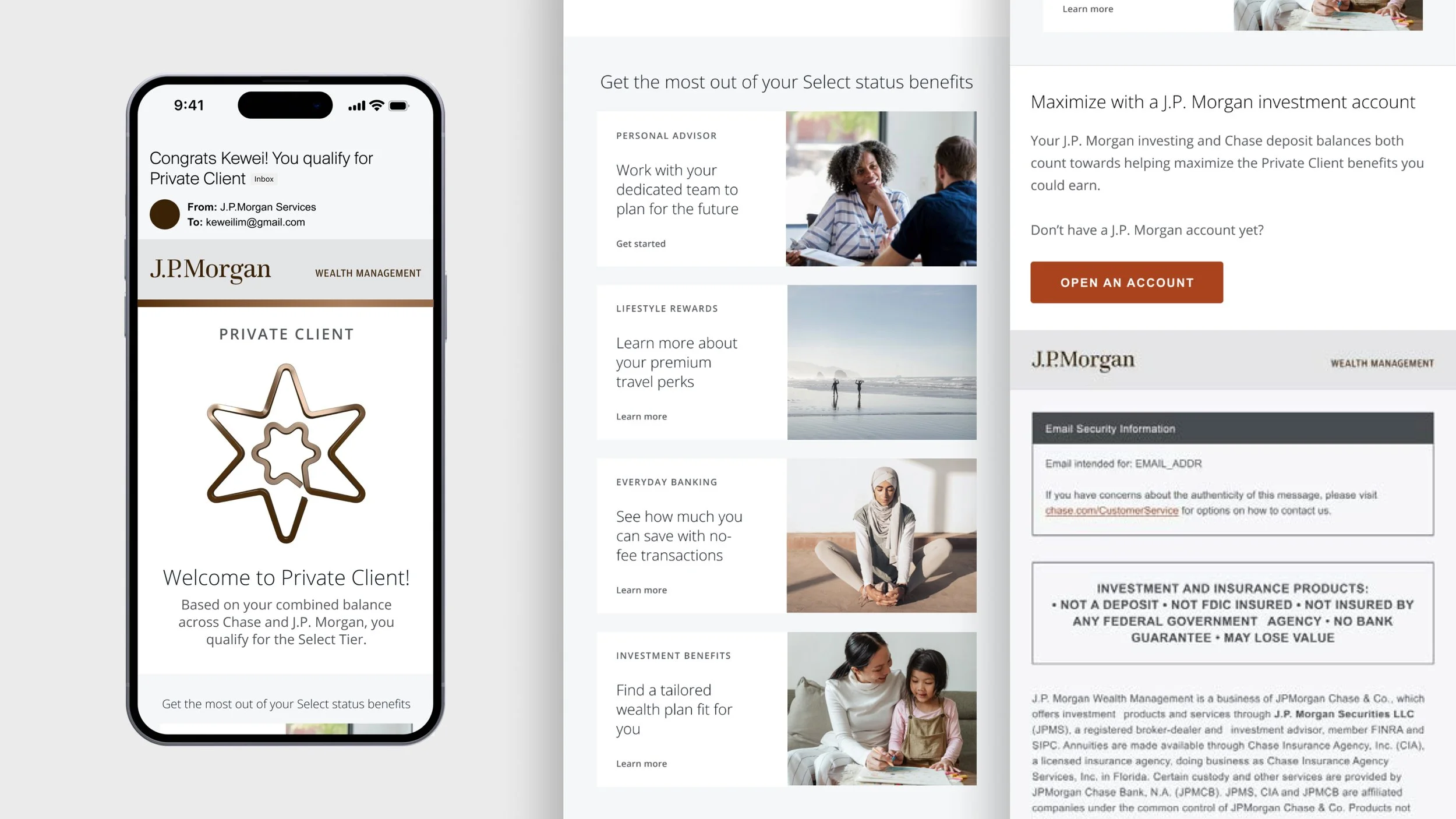
Symbol Illustration
The Challenge
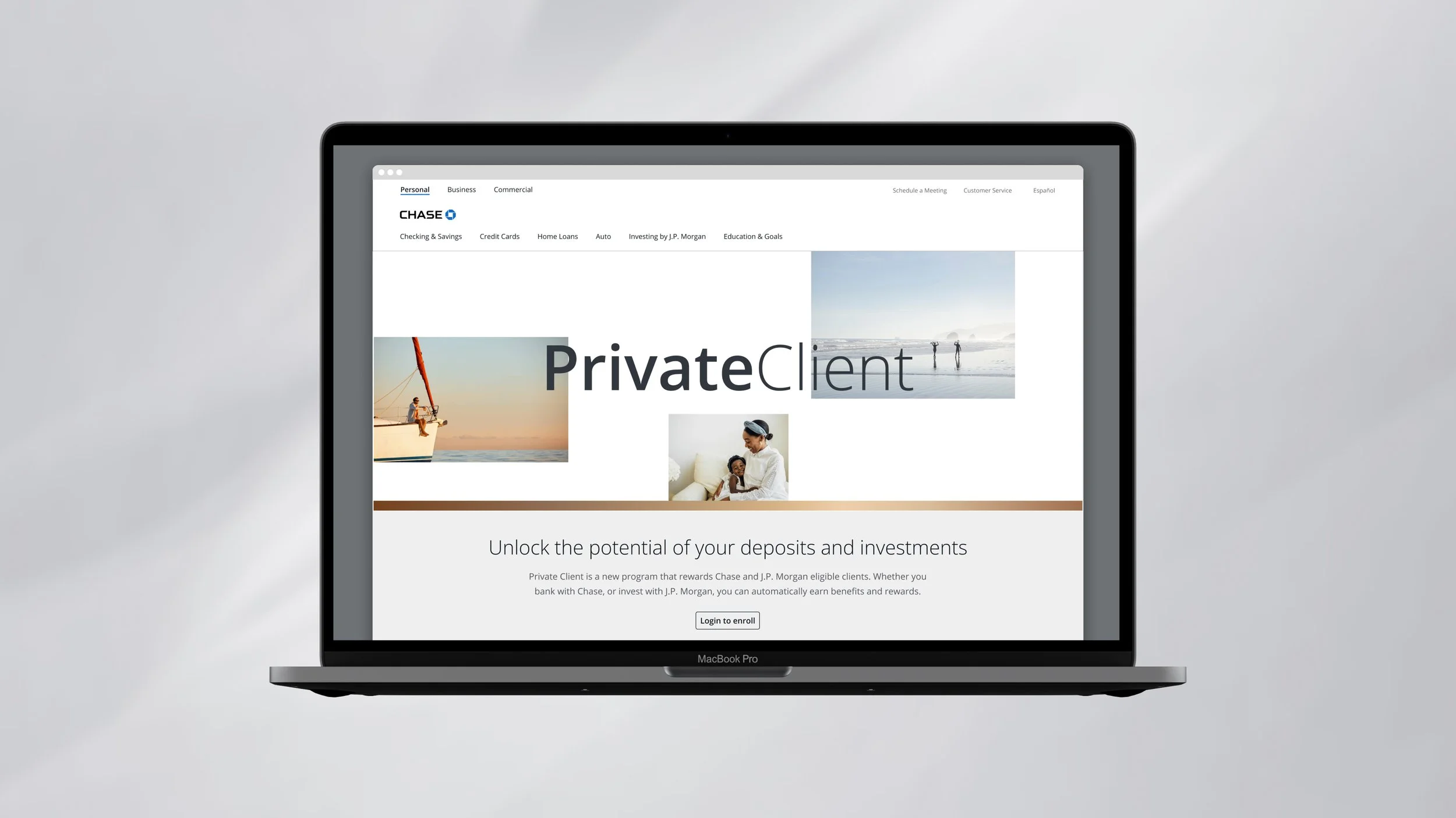
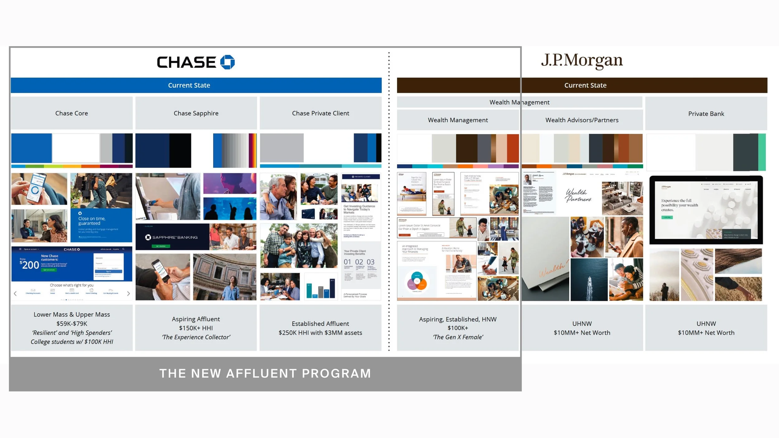
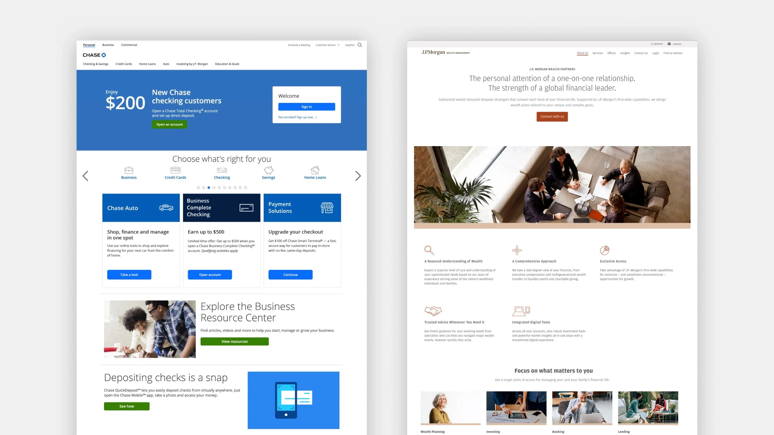
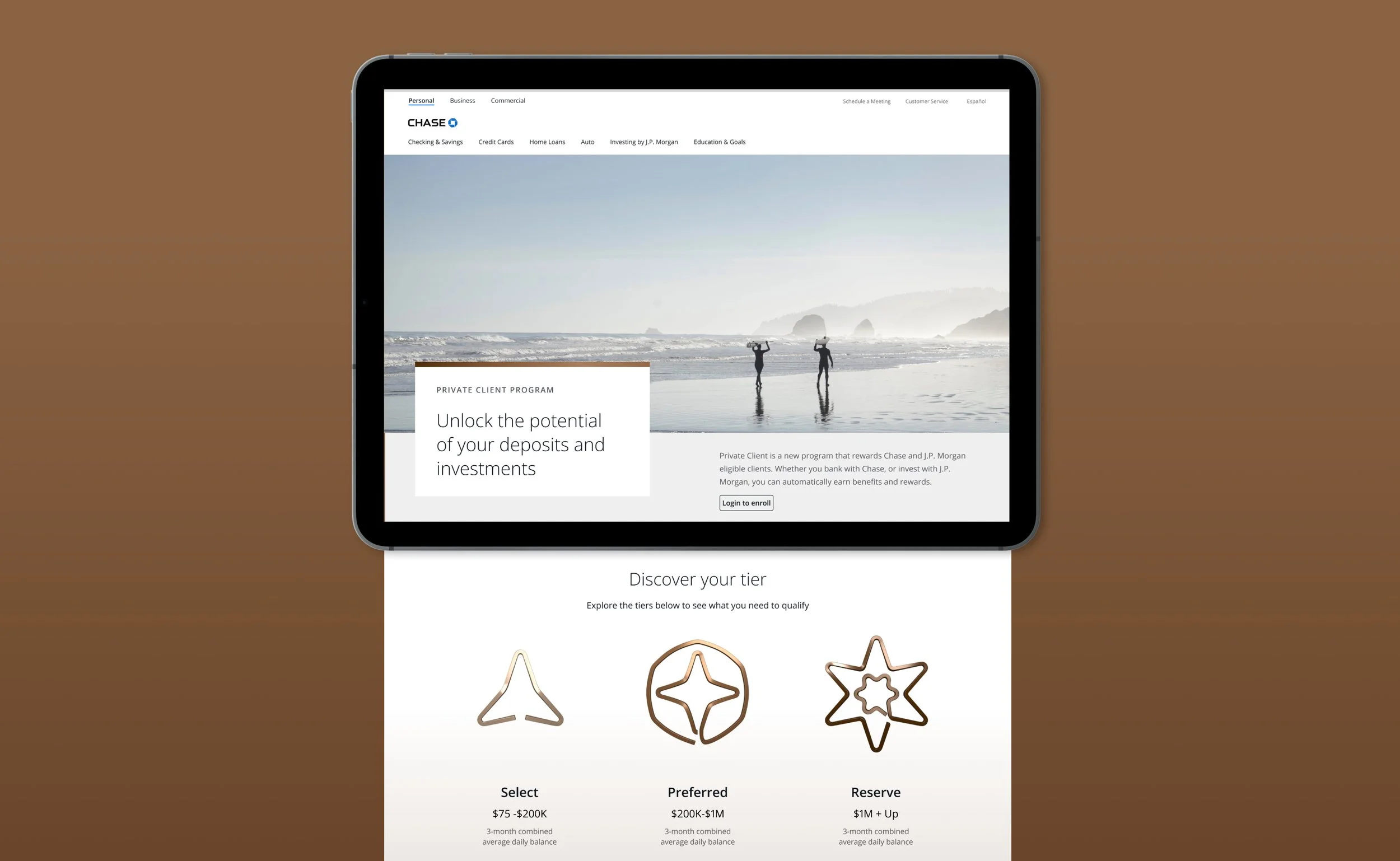
“Private Client” is a new affluent rewards program for Chase and J.P. Morgan customers based on deposit or investment balances, or a combination of both. It has multiple tiers with additional benefits per tier, but is not tied to any specific banking product.
It was important to the JPMC team that the visual identity of Private Client spoke to their affluent consumers on both sides of the firm (Chase and J.P. Morgan) without introducing another new sub-brand or unusual elements. The identity needed to appear masterbrand-agnostic to communicate that eligibility is based on total balance across both accounts. It also needs to signify increasing value as a customer moves up the tiers.
Approach
frog explored multiple design directions—experimenting with varying levels of brand association and utilised thoughtful design approaches to create visual identity systems that would bridge the two brands—aligning with the “better together" strategy. All three directions use shared elements from both brands (type, colour, layout, photography) to create a unifying identity to float across the various contexts.
By honing in on shared elements across affluent sub brands, frog created an identity that could seamlessly float across contexts, touchpoints, and marketing situations. Using affluent research materials provided by Chase, frog created sample personas and journeys to identify the most relevant touchpoints.

Design Criteria
Flexible
The visual identity and messaging system must be able to flex across brands, channels, and contexts.
Clear
Amongst an array of offerings within Chase and J.P. Morgan, it is important that the message about this program is clear. The audience needs to be able to understand what this is, how to qualify, and how to use it.
Premium
The visual identity and messaging system must speak to our affluent audience with an elevated look & feel, and voice & tone.
Desirable
The visual identity and messaging system must elicit desire for private client status through a compelling story and visual language.
Deliverables
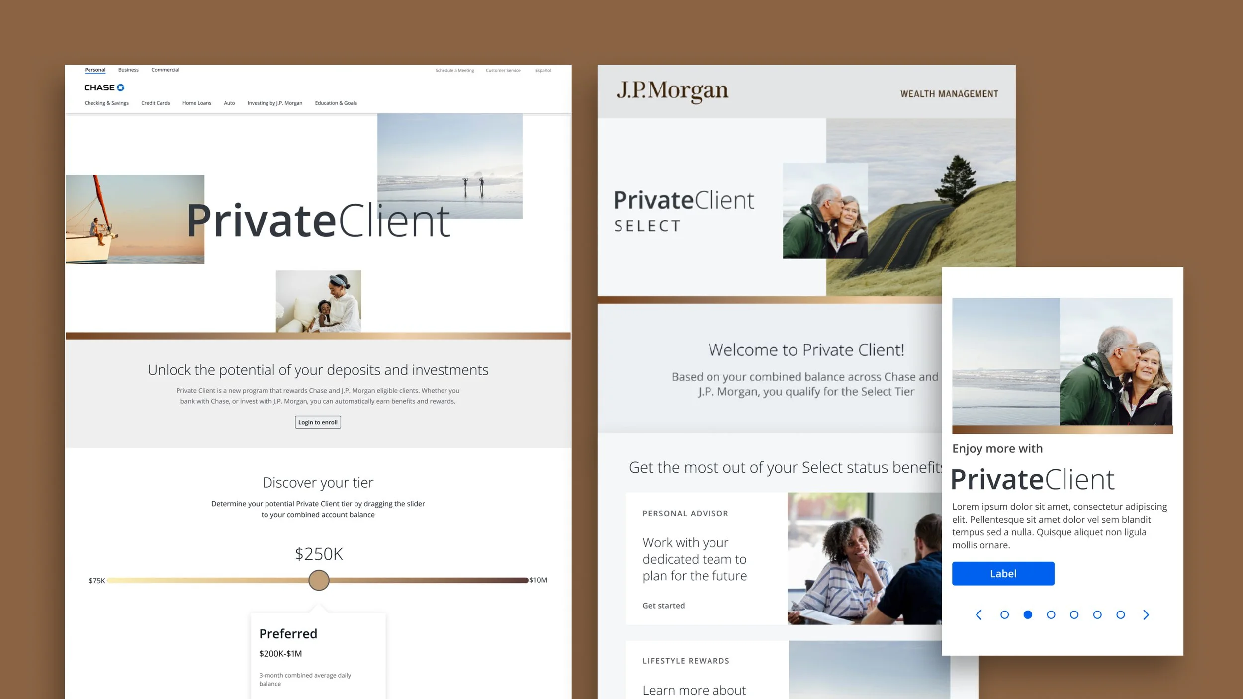
frog delivered three visual directions across various digital experience touchpoints, including cross-brand landing pages, desktop ad modules, mobile ad modules, app widgets, and cross-brand email designs. These directions were taken into testing to understand how different design decisions resonated with consumers.
frog carefully introduced visual identity elements into the three directions, such as a new wordmark, colour system, iconography and photography. All of these elements build on what already exists in the brand landscape. Overall, the stakeholders from Chase and J.P. Morgan were very happy with how the new Private Client identity felt elevated and premium and still fit seamlessly into either brand.

1: Real Rewards
This direction showcases the tangibility of the benefits with photography. Whether you are planning a future for your family, just starting retirement, or enjoying a life of travel, the subject matter of the photography speaks to our varied audience with a bright, clean, optimistic expression.
Visual Characteristics
Champagne gold brand bar
Bright, airy photography depicting an affluent lifestyle
Editorial style layout
Tier system through color

Defining Attributes
Leads with program name and hero image
Value proposition is secondary
Tier system leads with colour
Colour palette and photography style leans JPMWM


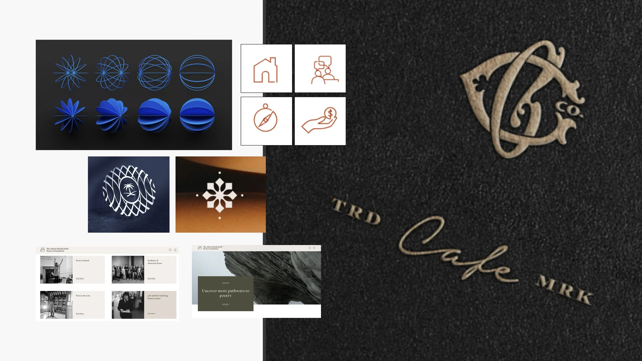
2: Status Symbols
Inspired by the distinguished elements of generational history featured on emblems, crests, and insignias; this visual direction functions as a maximalist but modern honorary badge that references being part of a nostalgic club with the ascending elite status tiers.
Visual characteristics
High contrast symmetrical symbols
Modular layout that still feels light and airy
Tier system through shape + color
Defining Attributes
Leads with value proposition and hero image
Program name is secondary
Tier system leads with shape and colour
Colour palette and photography style leans JPMWM


3: World Unknown
Using our personas’ goal- oriented mindset as a starting point, this visual direction captures the idea of discovering a world unknown. The future is undefined but our affluent consumer knows to pursue it with confidence. The awe-inspiring nature of the visuals also reference special access to events and rewards. The dark palette is historically a perception of luxury.
Visual characteristics
Gradient brand bar across photos
Editorial style layout
Tier system through type + color

Defining Attributes
Leads with value proposition, program name, and tier name equally
Tier system leads with type and colour
Color palette and photography style leans Chase affluent